The Art & Design of Factory Records
The iconic Manchester record label.
Written by Craig Berry
Designer & Writer

In July 2018 I travelled from Amsterdam to Manchester for the day to visit the Manchester International Festival and in particular, the exhibition: True Faith – an exhibition dedicated to the legacy of Joy Division and New Order. I wanted to go for the obvious reason of seeing the visual and cultural legacy left these two bands, but also to view it from a northern design perspective.
Manchester and music go hand-in-hand. There is something about the northern city of Manchester that breeds iconic bands over time. Jazz and Blues cafes in the post-war industrial and blue-collar-worker city in the 1950s and 1960s helped to build the Northern Soul movement and scene. The 1970s and 1980s saw the rise of Punk and then Post-Punk with iconic bands like Joy Division (later New Order) and The Smiths. The 1990s, with the help of The Haçienda nightclub saw the birth of ‘Madchester’ and the acid house scene grew — bands and groups like the Happy Mondays and Stone Roses with their baggy and upbeat rhythms. Throughout this time in Manchester, the record label Factory Records—set up by Tony Wilson and Alan Erasmus—was building and developing an international image of the city through its music, art, design, architecture and general ethos.

Started in 1978 the label steadily released music over the decades that followed, its roster included the likes of Joy Division, New Order, Happy Mondays, The Durutti Column, A Certain Ratio, OMD and more. The music was, and still is, great but the platform that propelled the music to the public, the physical records, has its own legal; one that takes the music to a different pedestal. The record label used a creative team with a large number of the band’s record sleeves designes by fellow Northern graphic designer, Peter Saville — giving the artists their own image but nothing concrete with record sleeves and posters having no real set style but more just an expression of the designer.
By the nature of design, each piece has its own story to tell with a number of the sleeves now celebrated as art pieces in their own right; you often hear stories of people with framed and hung copies of Unknown Pleasures, they are so iconic that to me the output by Factory Records can be seen at times as art instead of what they really are which is pieces of graphic design.
The label itself used a (at the time) unique and (somewhat)extensive catalogue system where each release was given its own number but not just limited to music; with posters, films, branded content on the system as well as more obscure listings such as the Hacienda nightclub (FAC 51), lawsuits (FAC 61), a hairdressers (FAC 98), a cat (FAC 191), flowers (FAC 282) and almost finally, the coffin of the late Tony Wilson (FAC 501).
Below are some of the most well known and iconic pieces of art and design by the record label as well as a few of my personal favourites for various reasons and also some of my favourite tracks.
FAC 1: The Factory (1978) (Poster)
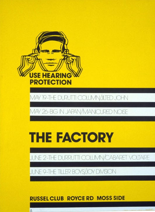
The first poster produced for the first event at ‘The Factory’ by label graphic designer and art director Peter Saville. At the time he probably wasn’t aware that this poster would set the precedent for what they label was going to be and eventually become one of the most iconic images of the label.
The Poster is actually a design for the Factory club, not the label. Industrial in style through the use of clear typography and yellow, black and white; with the ‘use hearing protection’ icon it echoes a health and safety poster. The graphic layout looks nothing like anything else released at that time and it stood out with the style being used on later releases. The uniqueness of the poster showed how different this music label and its artists were going to be like.
FAC 2: A Factory Sample (1979)
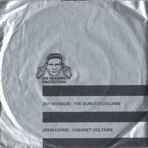

The first release by Factory Records as a label; using the same 3 stripe layout as the above poster. It is a double 7" sleeve, again like nothing else that was being produced at the time, shunning the 12" traditional card sleeve for a rice paper, dyed silver and sealed inside a thin plastic bag.
As well as the two 7" EPs inside, it also featured a number of stickers. Again showing that this label was going to be something different and not the usual.
FACT 10: Joy Division – Unknown Pleasures (1979)
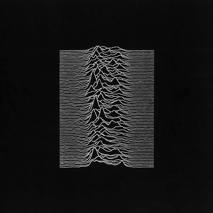
One of, if not the most, well known record sleeves by any music artist ever (it’s easily as iconic as albums like Pink Floyd – Dark Side of the Moon or The Beatles – Sgt. Pepper’s Loneley Hearts Club Band). Unknown Pleasures, with the image, of what is actually radio waves emitted from a collapsed star, has been reproduced on numerous objects and merchandise since its release.
The original image was found in a publication of a Cambridge University astrophysicist with Peter Saville inverting the image to create a dark and mysterious white shape floating in the black space. With the (at the time) revolutionary idea to not have any text on the front of the cover thus not informing the viewer of the artist or title.
A great debut album for the band as well featuring the dulcet tones of Ian Curtis over melancholic chords–the perfect combination, Disorder is the opening track and sets the mood for the rest of the album.
FACT 14: The Durutti Column – The Return of The Durutti Column (1980)
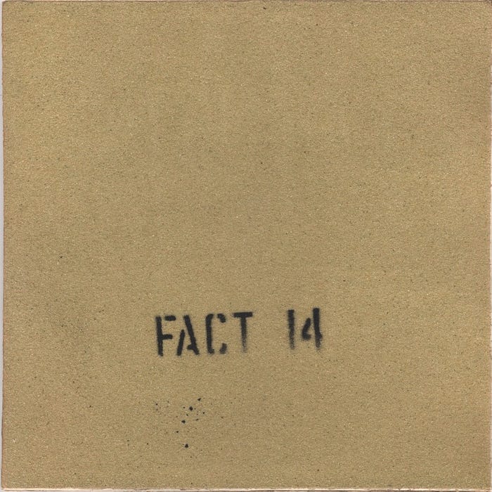
This version of The Durutti Column’s – The Return of The Durutti Column was designed by Factory founder Tony Wilson and is hailed as “the most punk album cover ever”. The concept of the record sleeve here is both sides were covered in a heavy-coarse sandpaper so the action of storing the record on a shelf would gradually destroy whatever it is placed next to in the act of taking it from the shelf and placing it back.
At the time there was no production company who could/would create such a ludicrious album, (there probably still isn’t) sticking sandpaper to the card so it was left to Joy Division, or more precisely, Ian Curtis to stick 2000(?) of these together with several variations of the spray-painted title–of course it is a highly sought after collectors item these days.
FACT 25: Joy Division – Closer (1980)
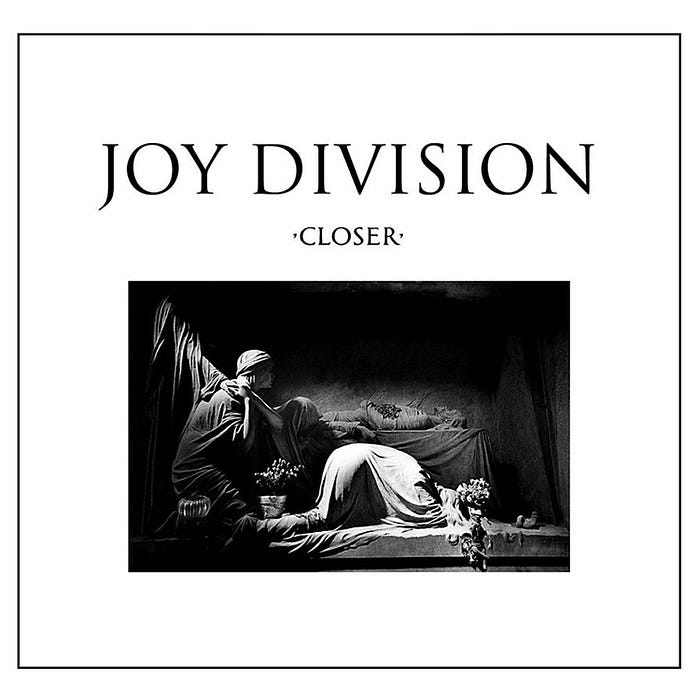
Joy Division’s second album Closer here designed by Peter Saville uses a photograph from French photographer Bernard-Pierre Wolff. It is said that the image is traceable to Appiani family in Genoa where a tradition of elaborate tombs exists. The choice of type here does somewhat reference this with its Roman serif style, Saville created this contrast between the classicism of the image and modernity of the music, the result: a postmodern proposition.
The album was released after the death of Ian Curtis with the artwork holding a lot of somewhat controversial significance.
FACT 50: New Order – Movement (1981)
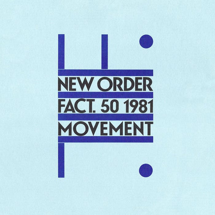
Following Ian Curtis’ death, the remaining members of Joy Division formed New Order, taking the post-punk sound from Joy Divison but implementing more modern electronic sounds. Their debut album Movement designed by Saville directly references Italian Futurist artist Fortunato Depero and the poster for a 1932 exhibition Futurismo Trentino.
Saville thought that the names Movement and Futurism went hand-in-hand since Futurism celebrates the idea of energy, speed and modernity which relates nicely with this new style of music from the band.
Dreams Never End picks up perfectly where Joy Divison left of.
FAC 51: The Haçienda (1982)
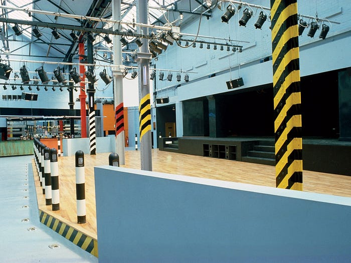
The Haçienda opened in 1982 in Manchester and mostly financed by New Order. The design of the nightclub interior was by Ben Kelly, suggested by Saville whom the pair where good friends and collaborators. Kelly was given unlimited freedom of the design of the nightclub only that it had to include a dance floor, balcony, bar etc. The resulting design was a predominantly pale and cool blue space with bright and bold diagonally stripe columns using urban patterns such as warning signs, bollards, directions etc. The red brick exterior hid what lay inside.
The nightclub started out as a relatively quiet venue with local bands like The Smiths playing gigs but later DJ’s like Mike Pickering and Graeme Park helped build the acid house and rave scene of ‘Madchester’ through playing at the Haçienda. Design groups like 8vo were asked to produce promotional material for the club which are now pieces of design history. Due to a number of reasons the club shut down in 1997 and it is now an apartment block. It has gone down in history though as a stronghold of the late 80’s and early 90’s British acid house scene and all the music that encompasses it.
FACT 55: A Certain Ratio – Sextet (1982)
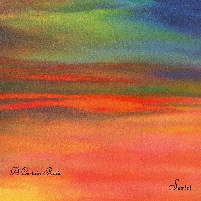
Despite not being as big as Joy Division or New Order, A Certain Ratio were still a well known and respected group on the Factory label with their interesting minimal and contrapuntal dance music.
This record sleeve is a beautiful combination of a post-impressionist style painting with its paint swashes but contrasted with the slick type for a level of sophistication.
FAC 73: New Order – Blue Monday/The Beach (1983)
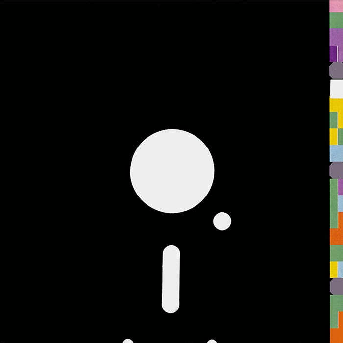
Probably New Order’s most well known song, Blue Monday/The Beach is claimed to be the best selling 12" of all time. The single’s design was a response to the developing and technological sound of New Order, based on the design of a floppy disk which the band used to store sounds for their synthesisers. The song was so technologically advanced at its time that it was originally composed and intended to be able to be played by the machines themselves without the members touching them. Saville saw the floppy disk as the signifier of this and thus the record sleeve has cut-outs like a floppy disk, with the edge having a colour-coded message system providing the information for the record (something later employed on further albums).
There is a common myth that the physical manufacture (the die-cutting and specific colours used) of this record sleeve actually lost money and cost Factory Records 5p per copy sold. And also in classic Saville fashion, the artwork was so late that he sent it straight to the printer, unreviewed by either the band or the label.
Blue Monday is easily one of the greatest electronic music songs ever, immediately recognisable and therefore it deserves such an iconic sleeve.
FACT 74: The Duritti Column – Another Setting (1983)

Factory Records also enlisted the help of fellow Northern designer, Mark Farrow to produce some of the album artwork for its artists. Here the artwork for The Durritti Column’s Another Setting, although there isn’t much information about this design, which might be relevant as it suits the sound and almost emptiness of the band, with its constantly changing members and incomplete line-up. Mark Farrow went on to become one of the UK’s established graphic designers, mostly through his approach to record sleeves for various labels but what I know him most for is his work for the band Spiritualized.
FACT 75: New Order – Power Corruption and Lies (1983)

Power, Corruption and Lies is probably New Order’s most well known album and a large part of that recognition comes from the album artwork. The name, Power, Corruption and Lies apparently comes from a quote sprayed onto the exterior of a gallery by Gerhard Richter in 1981 and when presented with this name Saville searched the National Gallery for an appropriate portrait but eventually decided it was too literal. Until upon leaving the gallery he saw a postcard with this image and realised its “subversively enigmatic suitability”.
By using the same code system as on Blue Monday he made reference to the idea that the digital world was becoming more and more apparent and the juxtaposition of the classic painting and digital code is what makes this album artwork so good. Saville quotes this piece as his most biographical work, reflecting his upbringing: the painting being the bourgeois furnishing of his family home and the coding being the landscape of the industrial North West.
The album is full of great songs: Village, Age of Consent, Leave Me Alone and We All Stand but my favourite is 5 8 6 for the optimistic and thumping beat throughout.
FAC 93: New Order – Confusion (1983)
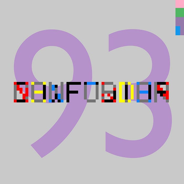
The last album in this piece that uses the code system; though here relatively simple. This is just a really good idea executed nicely, again the digital and technological aspect comes through the pixelated type which cleverly has the same number of characters (including the space) for NEW ORDER and CONFUSION. It is one of the few times where the Factory numbering system is used as the artwork, here it is unapologetically huge. Nice, simple and somewhat modernist.
FACT 100: New Order – Low Life (1985)
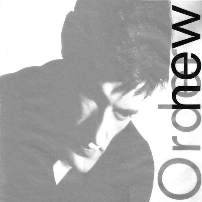
This record sleeve design marked a moment for Saville, by using portraits of the group he made a departure from conceptual appropriation. A more simple design but still using modern methods, here Polaroid film and compressed into a square using digital processes. Translucent film covers the image with text printed under and on top of this which one critic interpreted a “veil of secrecy surrounding the group”. At the time the band were rarely interviewed or photographed, at least the photography here was somewhat conceptual and not an obvious group photograph of the band.
Many people will have inadvertently listened to the song from this album, Elegia, due to its use in Netflix’s Stranger Things series on episode 5. It suits the show perfectly with its eerie yet mesmerising and encaptivating synths. The full 17 minute version is something special. Also for the record, Joy Division’s Atmosphere appears on episode 4.
FACT 150: New Order – Brotherhood (1986)

With the idea of the ‘essentialist aesthetic’ and the work of Yves Klein, Saville found a catalogue for a major Klein retrospective at the Centre Pompidou in 1983. What Saville liked was the use of pure colour to transform the ever day, with his associate Trevor Key, they played with the idea of the oxidisation of metals–exploiting the qualities such as the “polarised surfaces and striated textures”. They say it was the perfect opportunity to create “everyday Kleins” which became the eventual album artwork complete with the manufacturers information.
It’s probably my least favourite New Order album, but Bizarre Love Triangle is still good and the most ‘New Order-esque’ song on the album—the rest all sound like filler to me.
FAC 183: New Order – True Faith (1987)
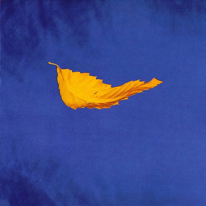
This record sleeve design is very similar to Joy Division’s Unknown Pleasures, the idea of having a single object floating in a vast open space. Here Saville Associates used a Dichromat process to create the image of a leaf falling but completely motionless, with hundreds of exposures made in order to refine their technique and find the perfect composition.
There is somewhat of a hint and acknowledgment to Yves Klein with the use of the very deep blue and the idea of emptiness or nothingness.
FAC 201: Dry Bar (1989)

Dry was opened on the 25th July 1989 by Factory Records with an idea of a bar more in keeping up with the cafe culture of Barcelona and Los Angeles. It was stated by Tony Wilson that “Dry” is to be to the bars what The Haçienda is to clubs.” The original design of Dry was unique and played an important role in the nations bar culture of today. Its position in Manchester’s city centre helped to develop the now thriving Northern Quarter, frequented by many a Madchester and Britpop band back in the day, it has famously barred both Liam Gallagher and Shaun Ryder in its time.
The design of the bar was somewhat similar to The Haçienda what with its industrial settings and open space; the design also by Ben Kelly. As of August 2016 the bar has been up for sale for £4m with planning permission for a hotel.
FAC 223: New Order – Fine Time (1988)

The success of The Haçienda in the mid 1980s due to acid house spawned a new aesthetic. Using 1960s hippy and psychedelia combined with bright and neon colour to reference the idea of the influence of hallucinogenic drugs. As Shaun Ryder of The Happy Mondays said in an interview: “The summer of 1987 is when everything changed. When life suddenly went from black and white to Technicolour. When we first got the E.”
This image by Saville Associates here for the single, Fine Time uses all these references as well as the repetitive and seductive lyrics of the song to create this composition of floating and overlaid ‘drug looking objects’, a “neo-trip”.
FAC 274: The Duritti Column – Obey the Time (1990)
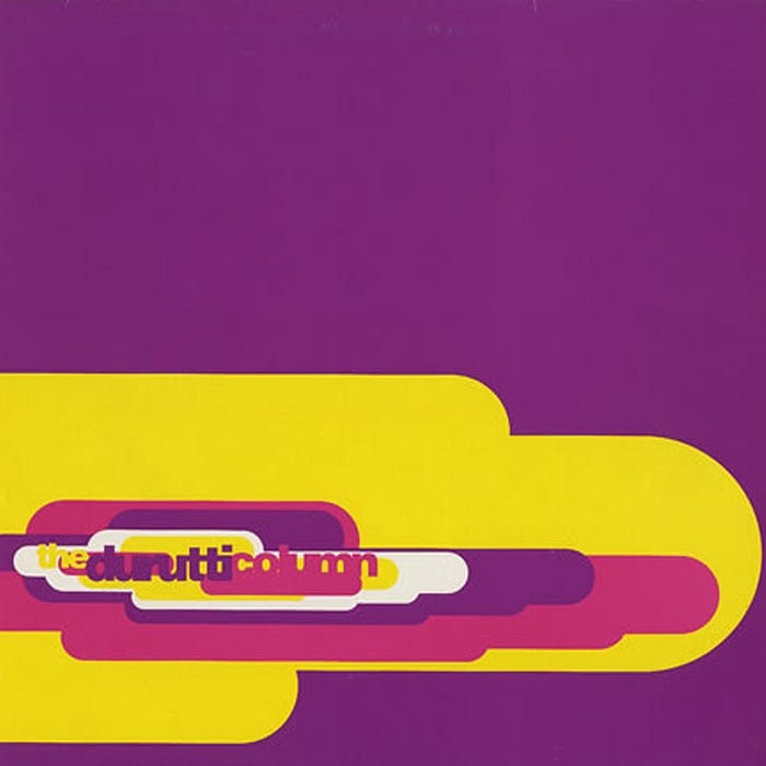
As well as Northern designers, Factory Records also employed the help of London based designers and design agencies. The agency, 8vo founded in 1985, consisting of Simon Johnston, Mark Holt and Hamish Muir. Their work was predominantly type-based and as well as producing promotional material for the Haçienda. They also designed a number of albums for The Duritti Column, often following this type-driven style.
For the Obey the Time album they say that their work was “driven by exploring what we could do with the two weights of Helvetica. The design would not have ended up looking like it did without working on a computer, but this time it was us in control of the design and not the software dictating terms.” This use of layering developed an already established 8vo approach.
FACT 250: Joy Division – Substance (1988)
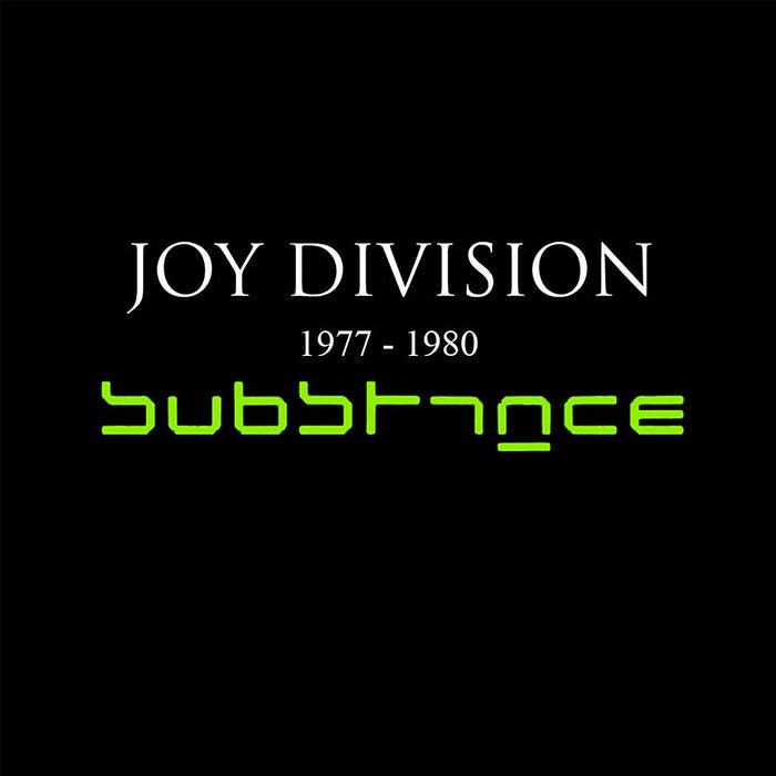
Joy Division’s singles compilation released 8 years after their disbanding is a quintessential example of the style of their album covers. Simply type floating in a deep black abyss. Brett Wickens of Saville Associates worked on the cover and chose to use Wim Crouwel’s New Alphabet typeface which was released in 1967. In Crouwel’s own words the typeface was “over-the-top and never meant to be used”. The Substance album cover actually reads ‘Subst1mce’ as a stylised and more legible version. The green digital type on black very much echoes a digital age which is a nice contrast to Joy Division’s music.
The album features some of the band’s most well known songs, Transmission, Atmosphere and the iconic Love Will Tear Us Apart.
FAC 320: Happy Mondays – Pills ’n’ Thrills and Bellyaches (1990)

The Happy Mondays were one of the bands that prospered through the acid house scene in Manchester. The upbeat, baggy and drug-fueled style of Shaun Ryder’s dance/rock band is echoed in this album cover, their most well known. The design of the cover by Central Station Design is littered with brand logos, illustrations and imagery in a garish and overly-busy composition. This loud composition references the style of music and the position of the band producing it. The amass of logos obviously means it has multiple copyright violations and therefore the US release was a more toned down version, unfortunately.
Step On is easily the stand out song from the album aka, “you’re twisting my melon man!”
FAC 401: Michael Winterbottom: 24 Hour Party People (2002) (Film)

A great summary of the ethos and output by the record label is the 2002 film, 24 Hour Party People, named after the Happy Mondays’ song. With Steve Coogan playing the label boss Tony Wilson it begins with the punk rock era of the late 1970s and moves through the 1980s into the “Madchester” scene of the late 1980s and early 1990s, following and focusing on the major artists of the label: Joy Division, New Order, A Certain Ratio, The Durutti Column and Happy Mondays, the storyline is a dramatisation of real events and rumours. It is a comical look at what the iconic music label ‘experiment’ went through; the ups, the downs, the profits, the losses, their innovative ideas and their money pits. It is also one of the few films that features an actor playing a graphic designer with Enzo Cilenti as Peter Saville.
Read more blog posts on craig-berry.co.uk or my Medium page.
