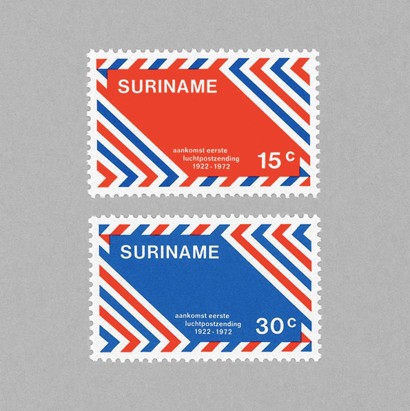
The Allure of Graphic Stamps
Philately for youngsters.
Written by Craig Berry
Designer & Writer
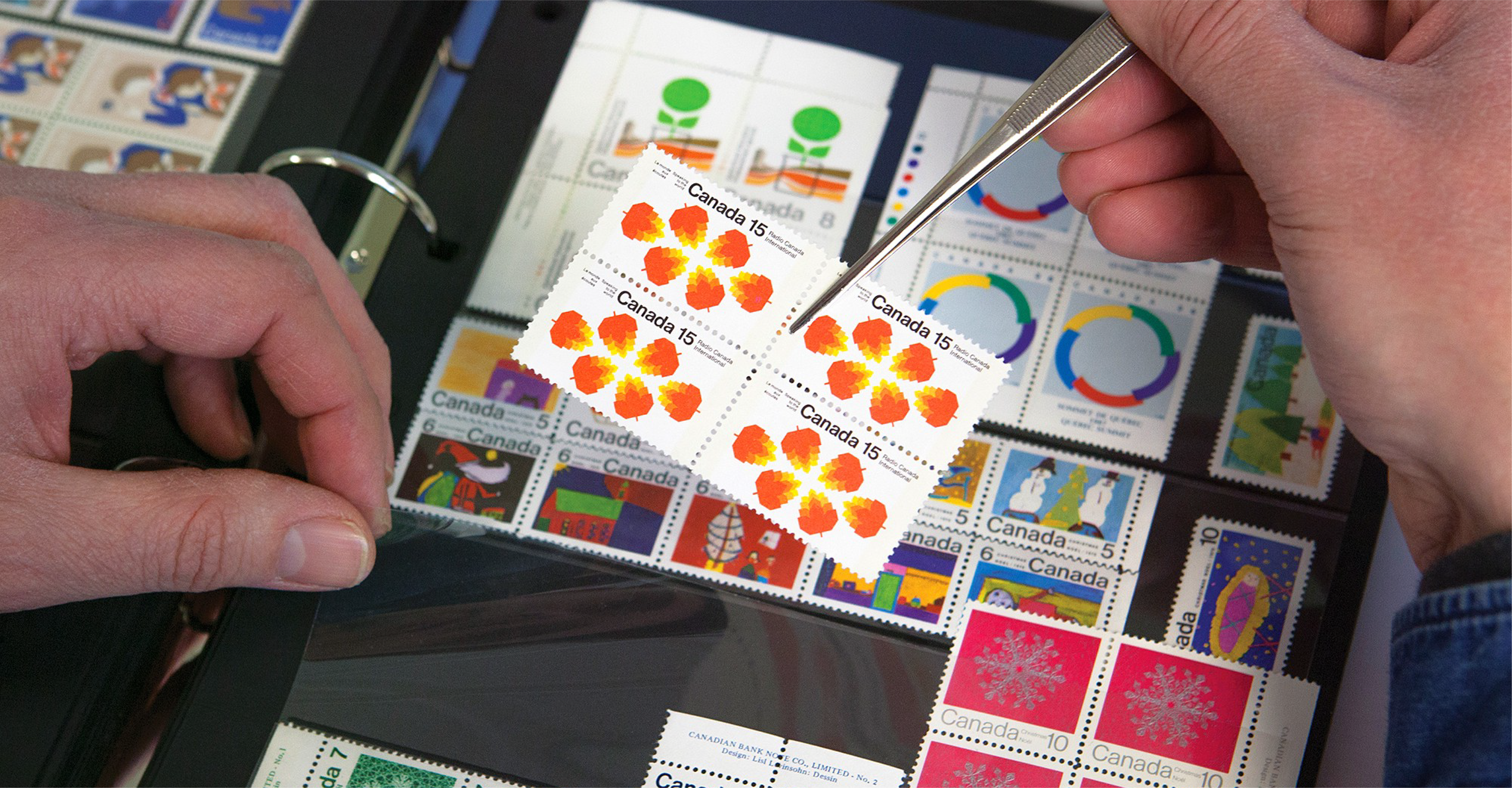
The term for somebody who collects stamps is a philatelist and the image that appears in your mind when you think of a philatelist is probably that of an middle-aged/old man wearing thick glasses, surrounded by albums and closely inspecting crusty old stamps, looking at their age and rarity with a magnifying glass, before neatly filing them away. This may be the case but recently there has been an appreciation by younger people for stamps, especially ones with beautifully designed graphics.
It was during a trip to the monthly IJ-Hallen flea market in Amsterdam Noord that I experienced this appreciation myself. After wandering around the seemingly endless stalls of old clothes, toys, vinyl records, pottery and general rubbish I found myself digging through a huge box of used stamps, searching for the most stunning graphics and colours.
Stamps from countries all over the world, each with their own distinct style, shape and charm and for 5 cents per stamp I couldn’t resist.
The reason I decided to even consider looking through this old and pungent box of stamps was because recently I started seeing more and more stamp related content appearing on platforms I look at, the likes of Instagram and graphic design pages such as It’s Nice That and Creative Review. As well as this continual online content, British book publisher Unit Editions released their tome, Graphic Stamps, as part #001 of their Archive Series.
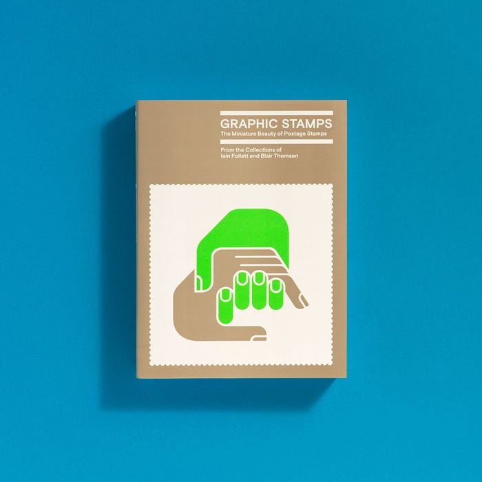
This immaculately designed book by the uber cool design agency Spin and edited by British design heavyweights Tony Brook and Adrian Shaugnessy documents the stamp collections of Iain Follett and Blair Thompson. Inside is a curated selection of stamps, choosing each particular design based solely on the graphic design and the graphic designers behind them, it’s not about (the arguably anorak nature) each country's postal history, although each stamp image featured does have a small piece of supporting text explaining when and why it was made and by whom.
It is Iain Follett who is behind the Instagram feed, @mintneverhinged which has an impressive 11.4k following. This feed is effectively the digital and more accessible version of the Graphic Stamps book, with Iain regularly uploading perfectly photographed images of stamps, each with its country of origin and designer etc. just like the book. It is clear to see by this feed and book that there is an obvious interest in the world of graphic stamps. Blair Thompson also has an instagram feed, @graphilately with a respectable 91.3k followers.


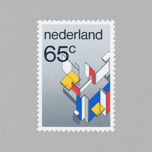
Reflecting back to my trip to the IJ-Hallen, I was amazed to find 2 Dutch 10c stamps from the 1976 numbers series, famously designed by Dutch graphic designer Wim Crouwel — which for me was like finding a piece of gold. I have also recently been reading and listening to Irma Boom talking about how she designed the PTT 1978/88 annual stamp book/Nederlandse Postzegels and how she speaks her love of these great stamp designs by Crouwel as well as Gert Dumbar, Karel Martens and Otto Treumann.
It seems that the Dutch are very good at designing these kinds of graphic stamps.



What did stand out to me more than the Dutch stamps though (at the Hallen) were the Swiss designs, or the Helvetia stamps (the Latin word for Switzerland and the somewhat origin of the Helvetica typeface name). Here was a plethora of beautiful designs adorned with block colour, type, graphic shapes, arrows, illustrations and everything in between. I couldn’t help but keep digging through this box to find more and more, it was almost obsessive. The dream here is to find some designs by the late typeface designer, Adrian Frutiger who was commissioned in 2005 to produce some stamps honouring some of his famous typeface designs: Univers, Frutiger and Avenir.


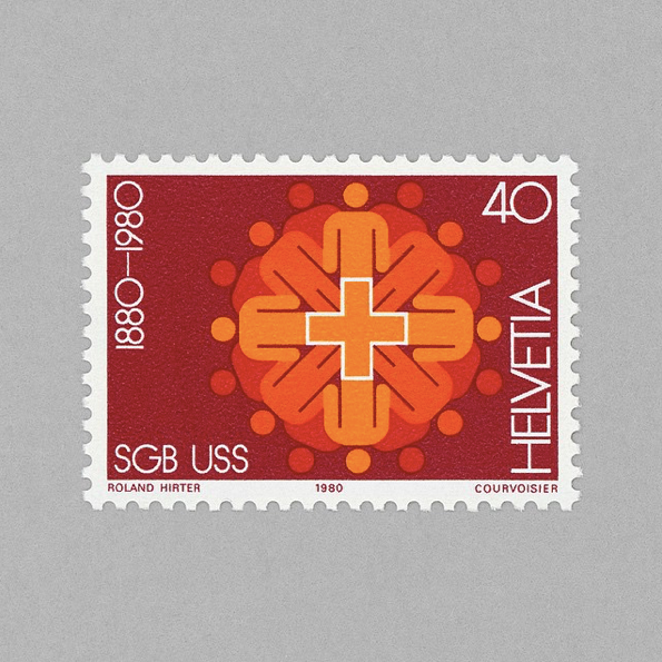
What I get from all these stamps from yesteryear is a sense of each country’s history, the stamps tell the stories of what happened over the decades, be it good, bad, celebratory or in memory. It is also a documentation of graphic design styles through time from classic modernist Swiss design to post-modernist collage. From photographic images to complex 3D shapes. From block colour to illustrations.

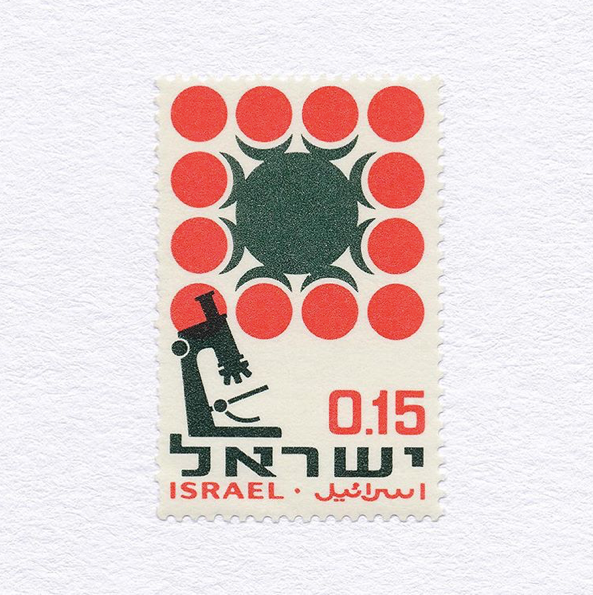

Back to the present day though and the Royal Mail in the UK have been producing some nice stamp designs recently, 2 of which stand out to me for several reasons. Firstly the Animal/Animail series by Osborne Ross in 2016 where endangered animals where the focus. What was really cool here besides the great illustrations was that the stamp itself was designed and manufactured with perforations inside the stamp allowing it to wrap around the top of a letter, giving the effect of the animal holding onto the letter. A very child-friendly stamp design which appealed to me.
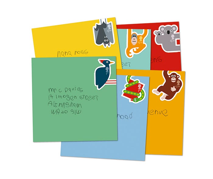
The second one is very recent, the David Bowie collection. This set of 6 stamps is dedicated to 6 of Bowie’s most iconic album artworks with each of the stamps showing the record sleeve and a 12" vinyl sliding out of the side. Designed by Royal Mail’s in-house design team, Studio Dempsey and Supple Studio, what is nice here is that it is obviously honouring the work of an important musician but also the great album artwork of his work such as the classic cover of Heroes to the latest and incredibly detailed design of Black Star by Jonathan Barnbrook. 52 sets of these stamps were recently launched into space for them to fall back to earth and there is a competition to win a set if you can guess the landing location.

Despite this fast moving world with more and more digital innovations every day it seems that posted letters and stamps don’t show any signs of being scrapped (yet) and although a lot of letters we receive through our doors have digitally printed postage labels and bar-codes, it’s still special to receive a hand-written letter or postcard adorned with beautiful stamps from wherever in the world it was sent from.


So next time you receive some post from a loved one, pay attention to the stamp attached in the top right, it could be more interesting than it seems.
Read more blog posts on craig-berry.co.uk or my Medium page.


