Pop Art at the Beurs van Berlage and Beyond
Meet some of my favourite artists.
Written by Craig Berry
Designer & Writer

When I first arrived in Amsterdam in August 2016, one of the first places I visited was the Modern Contemporary (Moco) Museum as they had an exhibition on Banksy and Andy Warhol – which was great and a nice introduction to the city in a way.
Fast forward almost a year and now there is another exhibition in Amsterdam on the work of Andy Warhol, at an unusual exhibition space (to me at least) – the Beurs van Berlage, a vast space. The exhibition here: ‘Andy Warhol and other Pop Artists’, focuses on one of the most important art movements and styles of the 20th century and here showcases some of, if not the biggest names of the style. The majority of the pieces on display here cover Andy Warhol’s wide range of work, from illustrations, simple prints and lesser known works all the way up to his most famous prints such as the Campbell's Soup Can series and the stand-out image of the exhibition, his Marilyn Monroe print.

It’s always a treat to see Warhol’s work up close and in person, you always appreciate these artworks better in the context of an exhibition space as it allows you to see things you would never see online such as how he used glittery inks or subtle gradients to make the work that little bit more special. But the best part in my opinion is being able to see the pieces in their full and accurate colour glory, not a dodgy digital image.
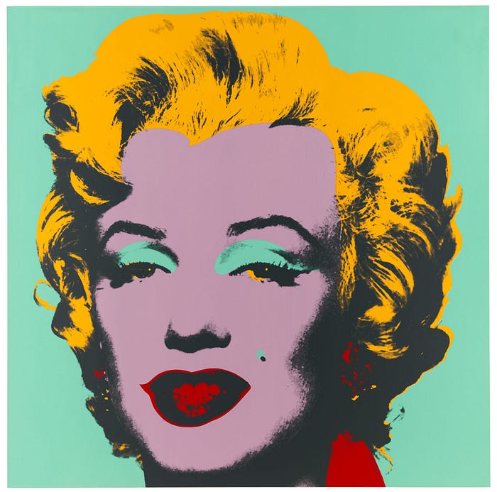
You can also see the methods that Warhol employed to create his artwork when you see a number of the same images aligned together but each with different colours and shapes – using the medium of silk-screen printing to ‘mass-produce/replicate’ his artwork which wasn’t being done in the contemporary art world before (not on this scale or value).
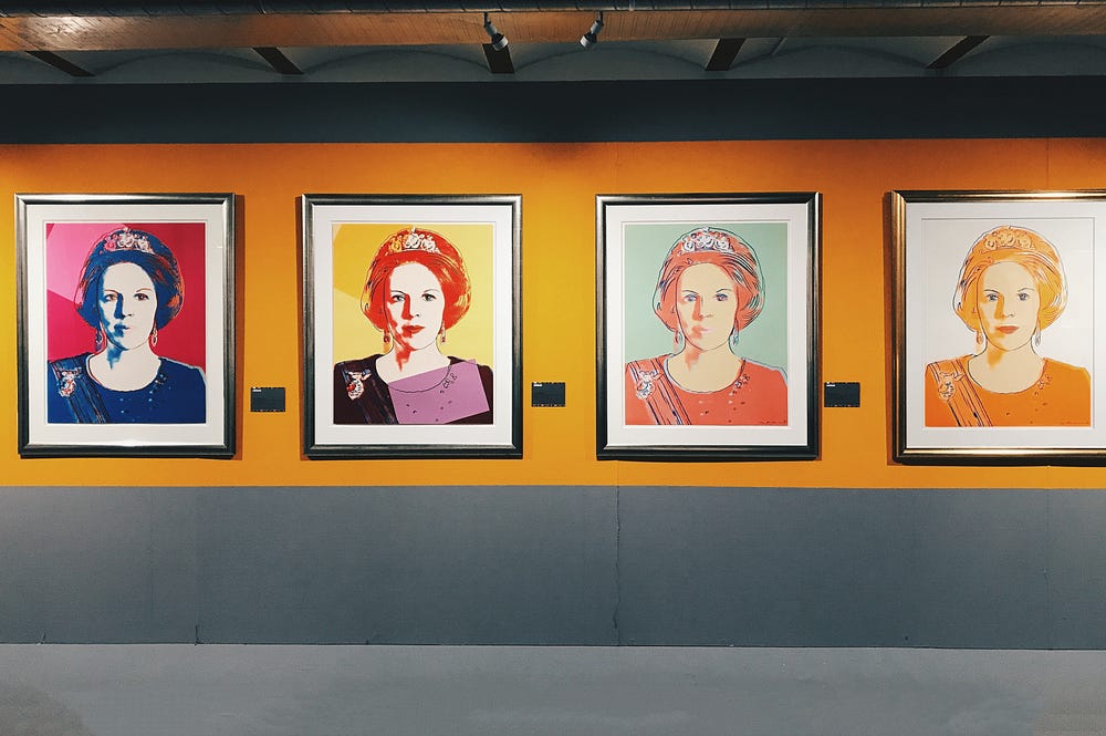
I briefly discussed the ideas behind pop art in my blog post about the MoCo Museum Warhol/Banksy exhibition but this is a way better example to show the strength and diversity of pop art and why it actually exists. Emerging out of New York in the 1950’s – 1960’s it was an important innovation in the overall history of art (as most new movements were and are).
Instead of classic painting styles and more abstract methods like cubism or such likes, pop art was accessible and recognisable to the everyday person through its focus on everyday consumer goods and brands, often with some meaning but at times just simply these items and logos were as big and loud as possible. It could be seen as one of the great ‘art heists’ by these artists getting this ‘everyday art’ style of work into big name galleries; of course pop art is now one of the most iconic and widely acknowledged styles of art of the 20th century with numerous artists all with their own unique styles.
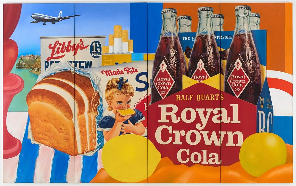
The ‘other Pop Artists’ on show at the exhibition were still some of the biggest names in pop art and art in general for that matter: Richard Hamilton, David Hockney, Gerald Laing, Tom Wesselmann and two of my favourite artists: Keith Haring and Roy Lichtenstein.
Firstly, Keith Haring is one of those artists that everyone seems to love and his work is immediately recognisable – beautifully simple and easy to take in but also often deceptive and with a deeper meaning. The clean lines and bright colours Haring used to create his work come across as fun and happy-going but at the time he was making them to address issues such drugs, apartheid, sex, AIDS, death and illicit love; using his art as a pro-active message that these issues could be portrayed in a lively and up-beat manner.


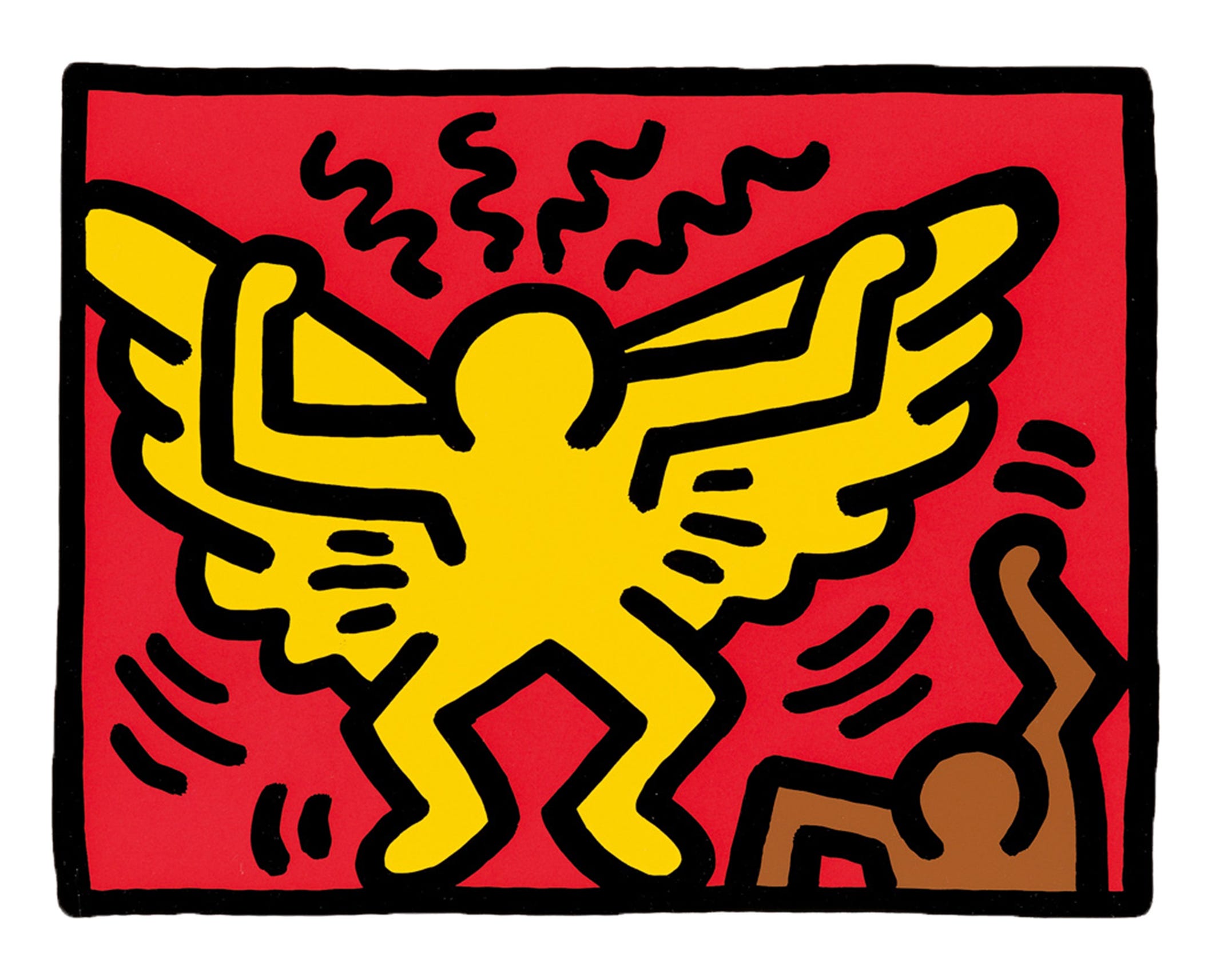
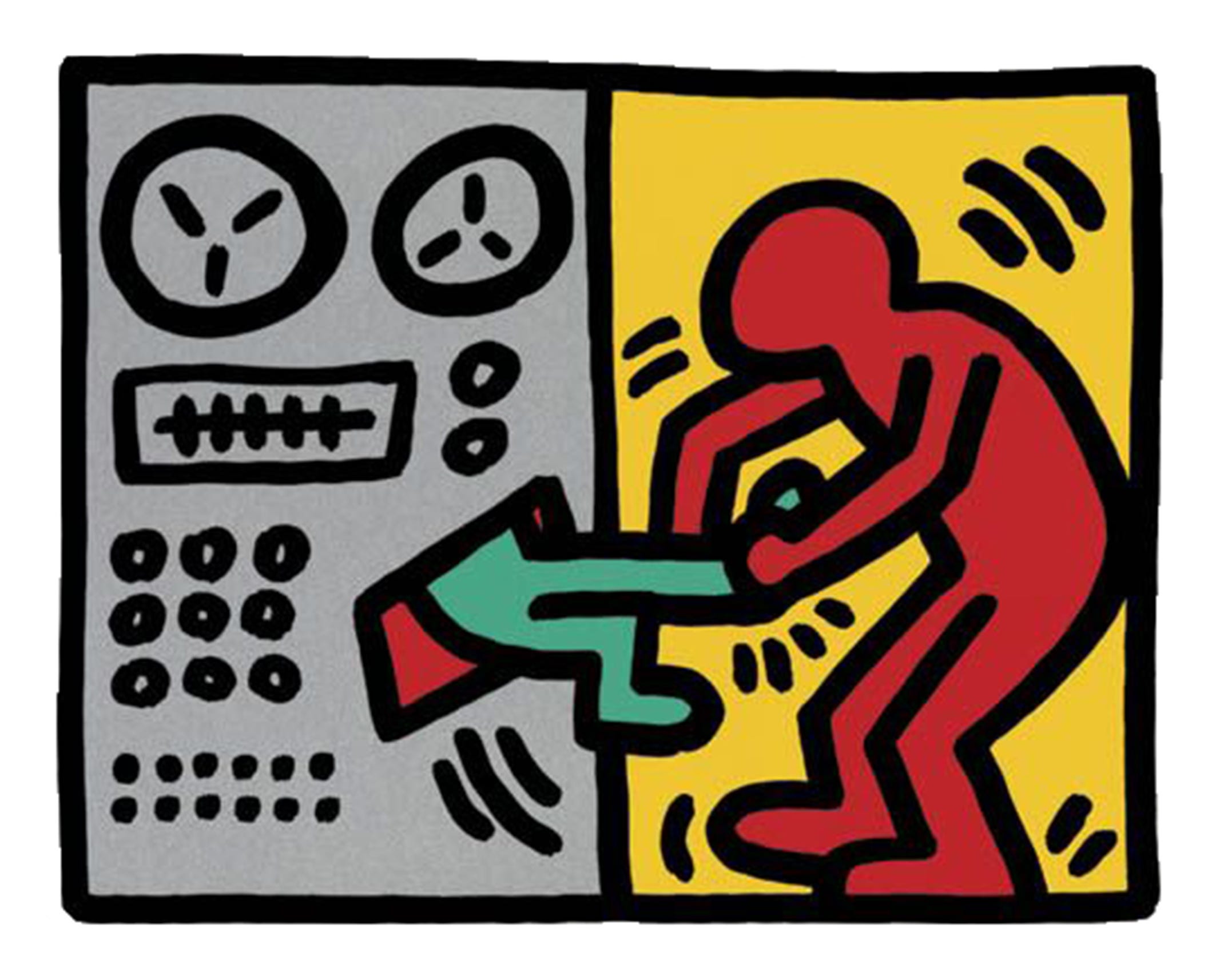

Haring’s distinct style was developed through graffiti, mixing with the likes of Jean-Michel Basquiat in New York City to organise exhibitions at night-clubs and other alternative locations. The subway was where Haring found his canvas, finding empty advertising panels at stations and filling these spaces with quick, white chalk artworks; working quickly he was able to carry out 30–40 of these pieces a day, nearly always using the same style dancing figures and often the same characters such as: crawling babies, barking dog, flying saucers and hearts.
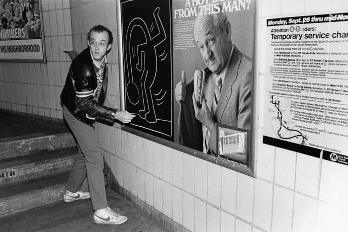
Each image seemingly produced on the spot without any pre-planned sketch to go off, purely freehand. It certainly attracted the attention of the commuters of the city as well as the city authorities and police; he was arrested for vandalism multiple times – but to him it was worth it. In this video below you can see the speed at which Haring was able to make these images. It also explains his ethos for his art, putting it on the subway stations so that it was accessible and visible to as many people as possible, for free.
Through these graffiti works and other artworks Haring gained notoriety and fame as an artist and had regular solo exhibitions across New York City in the early 1980’s as well as numerous international exhibitions where his work was beginning to become admired by the wealthy and important. Although Haring preferred the way he made his subway images – easily accessible and for everyone. This prompted him to set up his Pop Shop in 1986, in his own words:
“Here’s the philosophy behind the Pop Shop: I wanted to continue this same sort of communication as with the subway drawings. I wanted to attract the same wide range of people, and I wanted it to be a place where, yes, not only collectors could come, but also kids from the Bronx.”
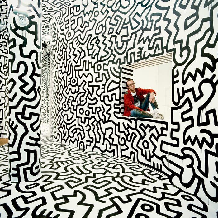
The exhibiton at the Beurs van Berlage mainly featured a handful of some of the images produced and sold at the Pop Shop as well as a painting he made for his friend in New York City, Andy Warhol. He said of Warhol:
“Of all the people I met, Andy made the biggest impression on me. He was the one who actually enabled me to focus on art. He was the first artist who helped me be an artist for the people.”
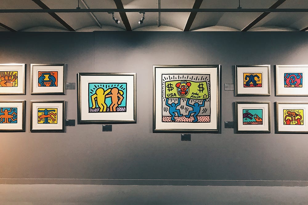
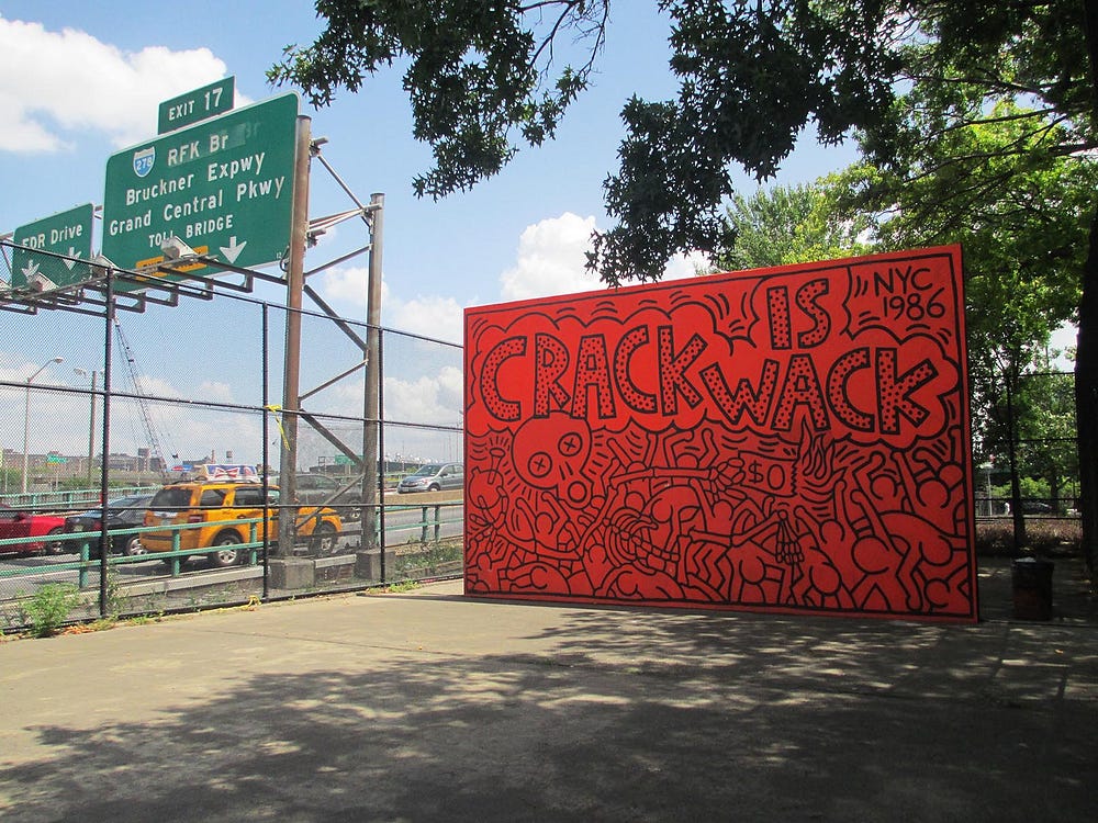
As well as these means of distributing his artwork, Haring also used large public spaces to create murals as messages. Over 50 of these were carried out, the most famous probably being the anti-drug ‘Crack is Wack’ mural in a Harlem playground. Originally painted illegally in response to the New York crack epidemic of the 1980s, he apparently received a $25 fine for the vandalism, with the parks department later contacting him to complete the mural after deciding they liked it, it has has been recently restored in all of its bright orange and black glory.

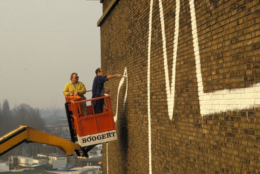
In 1986 the Stedelijk Museum in Amsterdam invited him for the first European exhibition of his work. He was also commissioned to paint a mural on the museum depot on the Jan van Galenstraat for the context of ‘urban renovation’.

Later, the mural disappeared behind a sheet to protect the museum depot building and contents from damp. So now it remains hidden from the public; Julia Gruen, director of the Keith Haring Foundation said this about the Amsterdam mural:
“With his work in public spaces, Keith tried to speak to the community directly. He saw the mural as a gift to the residents, to enhance their sense of belonging. It is up to the city of Amsterdam to bring this hidden treasure back to life.”

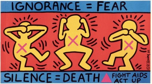
Sadly Keith Haring died in 1990 at the early age of 31, throughout his career he used his artwork to raise awareness for AIDS and in a cruel twist of fate he himself was diagnosed with the illness in 1989 which was the cause of his death a year later. Although before he died in 1989, before this, he established the Keith Haring Foundation to provide funding and his artwork to multiple AIDS organisations, as well as allocating resources towards finding a cure for the illness.
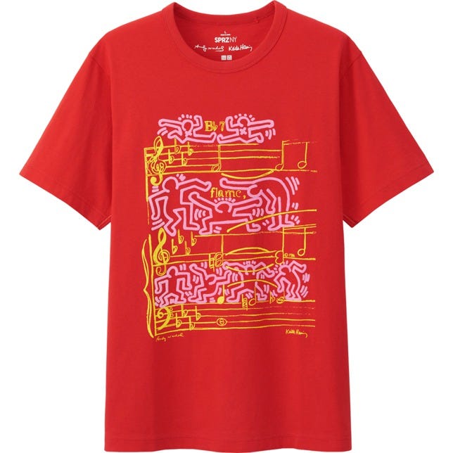
But Haring’s legacy remains prolific, recently there’s been a number of fashion collaborations, such as Uniqlo and Obey using his fun and lively artwork on clothing. Google honoured his 54th birthday in 2012 with a ‘google doodle’ and a (somewhat) recent health campaign in the UK used a Haring-esque style to educate and encourage people to be active and exercise – using the style to make these things more fun, the same way Haring did himself.


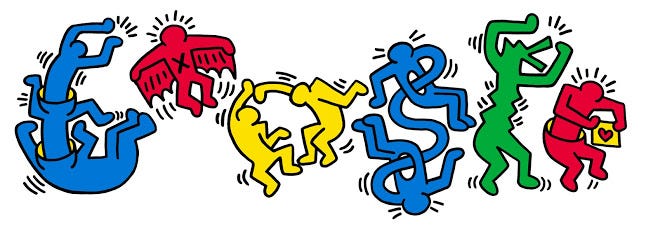
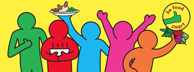
Keith Haring also showed the power of using public spaces and the streets to share messages – artistic and political. He gave street art a credibility and legitimacy, getting it into art galleries and museums and somewhat paving the way for street artists of today such as Banksy, Shepard Fairey and Kaws.

If Keith Haring was a ‘rebel street artist’, Roy Lichtenstein was more of a ‘traditional gallery artist’ but still with an equally as iconic style. His work is immediately recognisable from the use of colourful dots and imagery of faces and explosions, to name just a few subjects.
The dots used in Lichtenstein’s work are remnant of half-tone dots used in printing processes to build up colour to form an image although they are actually ‘Ben-Day’ dots; the difference between the 2 being that Ben-Day dots are always of equal size and distribution in a specific area, where-as half-tone dots vary in size and distribution. Lichtenstein used this method but enlarged the dots for more impact, painting the dots into confined black outlined shapes combined with solid colour.
The artwork he produced using this and similar processes varied in styles, my favourite of these styles being images remnant of comic strips; the content confined into a frame, the most known having a woman in some form of distress, angst or trepidation. What makes these works so compelling is that you can only see the single sentence that the woman is saying down the phone – you can’t tell what the person on the other end is saying, you have to imagine the backstory and the conversation that is going on, he is making you really read into the artwork – especially through the use of the ellipsis and unfinished sentences. Of course it’s not a real conversation but he has chosen these comic frames for this strength, to provoke the audience this way and imagine it is real.
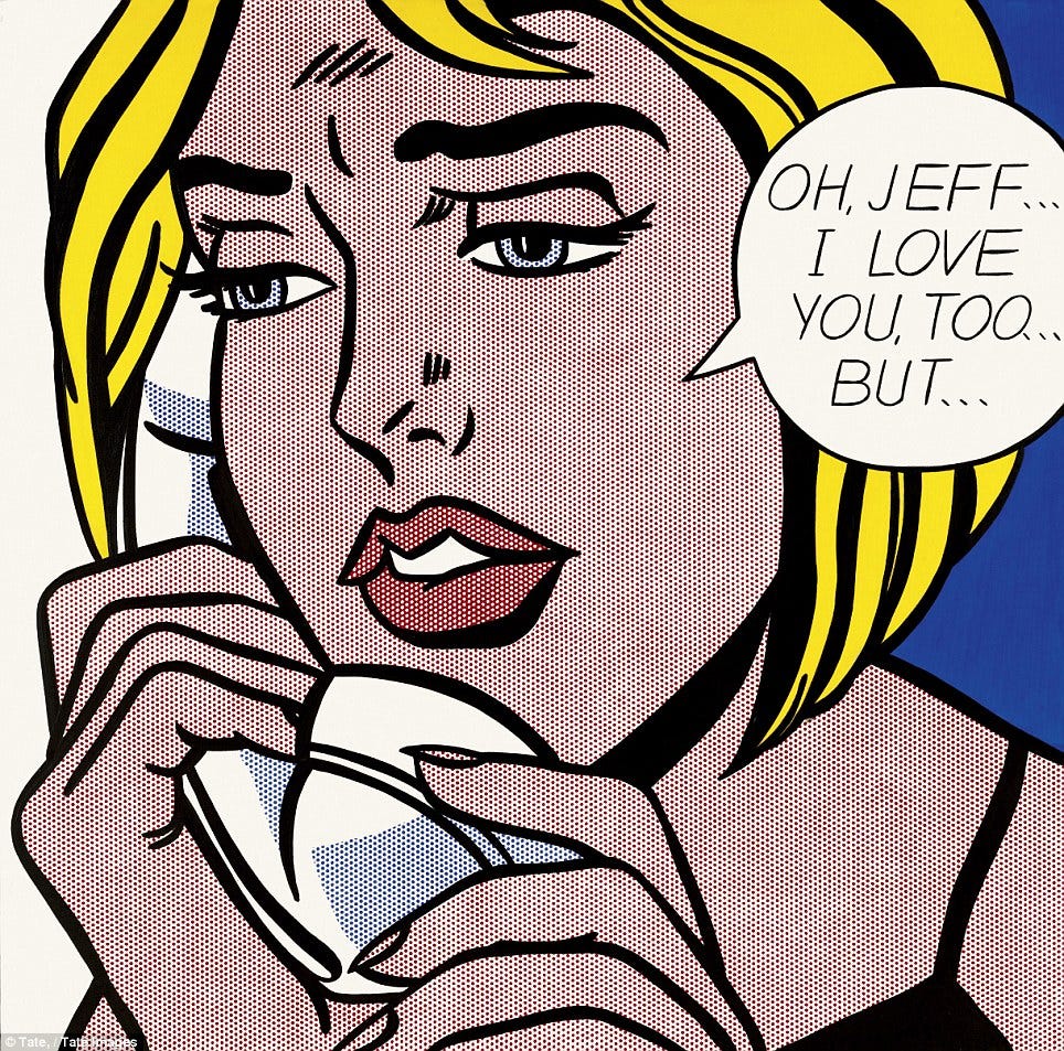

It’s interesting how he was able to arouse these kinds of emotions through such a cold, mechanical and almost robot like process of painted dots – pixels before pixels were around. Of course he did not paint each dot individually as that would've been painstakingly slow and an uneconomical use of his time, instead he used perforated stencils, painting over these and then removing them to reveal the perfectly round and aligned circles.
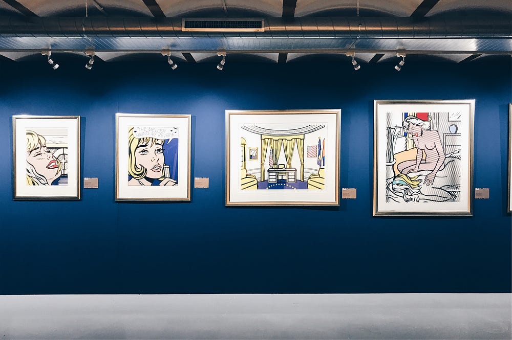
The pieces of work on display at the pop art exhibition at the Beurs van Berlage were a small selection of these styles of paintings featuring predominantly women in this dot style.
Also at the Stedelijk Museum as part of their ongoing ‘100 years of De Stijl’ exhibition is a vast Lichtenstein triptych: ‘As I Opened Fire’. It is a nice addition to this exhibition around De Stijl, of course it is not the same as paintings by Mondriaan, nor is Lichtenstein a De Stijl artist but it highlights the colours Lichtenstein used in a lot of his work – red, yellow and blue with black and white; that with the geometric forms of the circular dots – they tie together nicely.
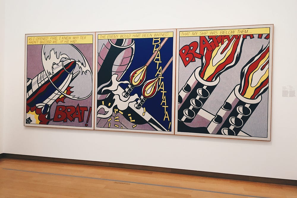
This piece has a somewhat clear message through the immediate imagery of guns, explosions and plane parts; produced in 1966 it could be seen as a comment on the Vietnam war that was taking place at the time. The strength of the triptych links back to this comic strip form that he employed in his work. Here it is like 3 scenes out of a film, each a piece of action frozen in time with the messages at the top directing you through the story. The scale plays a big part too, these are huge images and images on screen just don’t do it justice, in real life you can get up close and really see the detail.
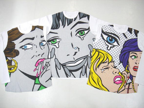
Similar to Haring, the popularity of Lichtenstein’s work has warranted numerous brands to collaborate or use his style, one collaboration/use of Lichtenstein’s work that stands out for me is Supreme’s use of his artwork in 2006, printed as big as possible on a shirt. Supreme has a long history of collaborating with these kinds of iconic artists and this is a great example; other examples of these Supreme artist collaborations are Jean-Michel Basquiat, KAWS, Sean Cliver, Daniel Johnston, Futura and Damien Hirst to name a few.
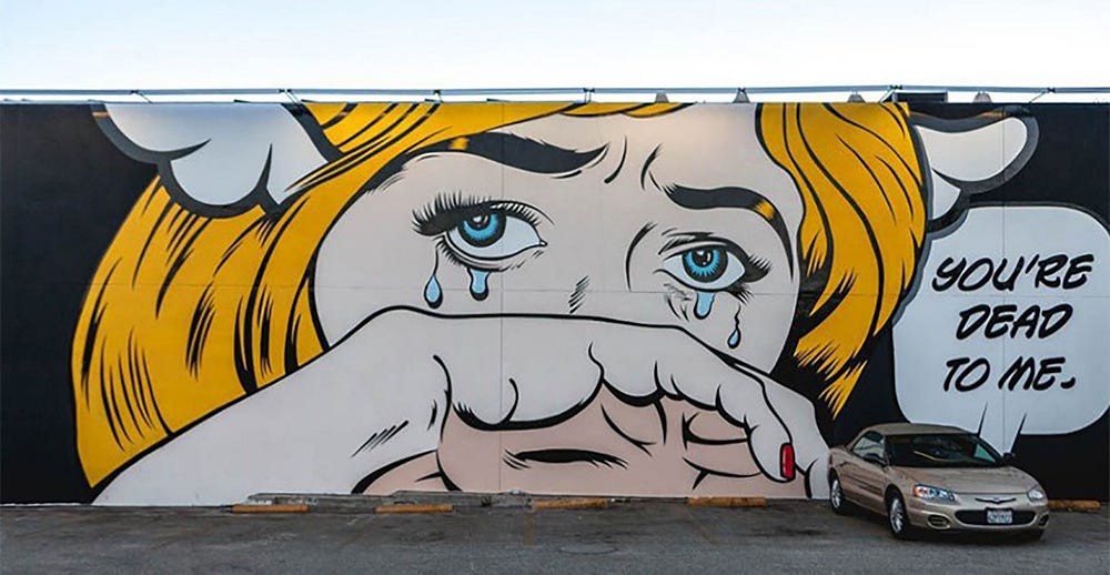
With such an iconic style it is easy to see other artists who have taken the style and interpreted it their own way. D*Face is a British multi-media and street artist who’s work has been described as ‘Lichtenstein-esque’ but D*Face uses a more macabre tone.
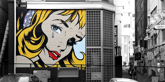

This image below is so clearly inspired by Lichtenstein it’s almost certainly an obvious and intentional parody, it could also be his comment on pop art as a style – taking something existing and re-appropriating it by adding your own style to it – as Lichtenstein did himself.
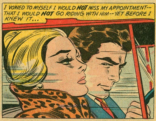
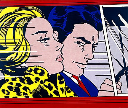

The left image is an original comic book illustration of which Lichtenstein re-appropriated (middle image), and then D*Face chose to parody in a more sinister way using his style. He claims that pop art never went far enough to critique consumerism:
“The one thing I felt about pop art is it didn’t ever have a strong underlying tone to it- it could just be anything and everything. I definitely felt like that about Roy Lichtenstein’s work, it didn’t really have a voice as such that was trying to articulate a view. For me it was much more a celebration, and that’s what I’ve tried to bring forward in my work. When I’m working illegally on the streets taking over a billboard, I’m using the exact methods and mediums which are used to sell products.”
I actually prefer D*Face’s style and work over Roy Lichtenstein’s but I think that is down to a generation thing–my generation are definitely into graffiti and street art and have a greater acceptance of this style of art over traditional galleries, seeing it as a fully legitimate style of art. Also, to me, D*Face’s work is way more graphic in terms of it being bolder and stronger but also through his use of skulls and death, there’s just more to look at and read into. To me it’s just way more interesting but its good to see where his inspiration comes from and how he interprets this.
Overall, its a great exhibition and this was a great opportunity for me to express my thoughts and feelings on some of my favourite artists. This exhibition is on display until the 30th September, and is definitely worth the trip into the city, there is so much stuff that I didn’t cover as well as the impressive exhibition space itself.
Read more blog posts on craig-berry.co.uk or my Medium page.
