Constructivist Art & Design
An imaginary excursion to Eastern-Europe.
Written by Craig Berry
Designer & Writer

In the past few years I have noticed a rise in the documentation and appreciation of Russian and Eastern-European art and design, with more galleries and museums exhibiting newly un-earthered collections of prints, posters, sketches and other ephemera. We are beginning to see more and more of these works in big institutions showcasing this iconic movement of the early 20th century. This write-up aims to elaborate on the theme of constructivist art and design via its history and some exhibitions I visited that address the movement.
The constructivist movement was an artistic and architectural philosophy that originated in Russia in the 1910’s at a time when the revolution of 1917 had been consolidated and the new Soviet government was building a new communist society. Constructivism took ideas from existing movements like Suprematism, Cubism, Futurism and Dada, but instead of using traditional artistic composition to create work and objects they replaced this with construction, hence the name constructivism. This was not limited to design however but also art, sculpture, architecture, fashion and theatrical design. At this time in the world, developments in maths and science by the likes of Einstein shook up the art world by showing how space and time worked; with this knowledge artists were creating less traditional and real scenarios in art and in turn becoming more avant-garde, abstract and futuristic in their approach and aesthetic.
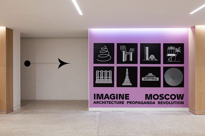
Two exhibitions I visited this year: ‘Constructing the New Man’ at the Stedelijk (Amsterdam) in February and ‘Imagine Moscow’ at the new Design Museum (London) in April, both focus on Russian art and design and constructivism but in different ways.
Firstly, The Stedelijk where the exhibition, ‘Constructing the New Man’, commemorated the Russian Revolution centenary through a vast presentation featuring posters, printed matter, films and art from the Stedelijk collection; a large space was dedicated to the exhibition exploring the art and design of these posters and films as propaganda. Firstly the poster, as a medium posters were (still are) an easy and effective medium for artists to convey their messages and to build and strengthen the socialist society; artists chose various production methods such as satirical cartoons, photographic editing techniques and collaging to produce their work. The collage style was effective, allowing for photo montage and early graphic design in terms of composition and use of type.
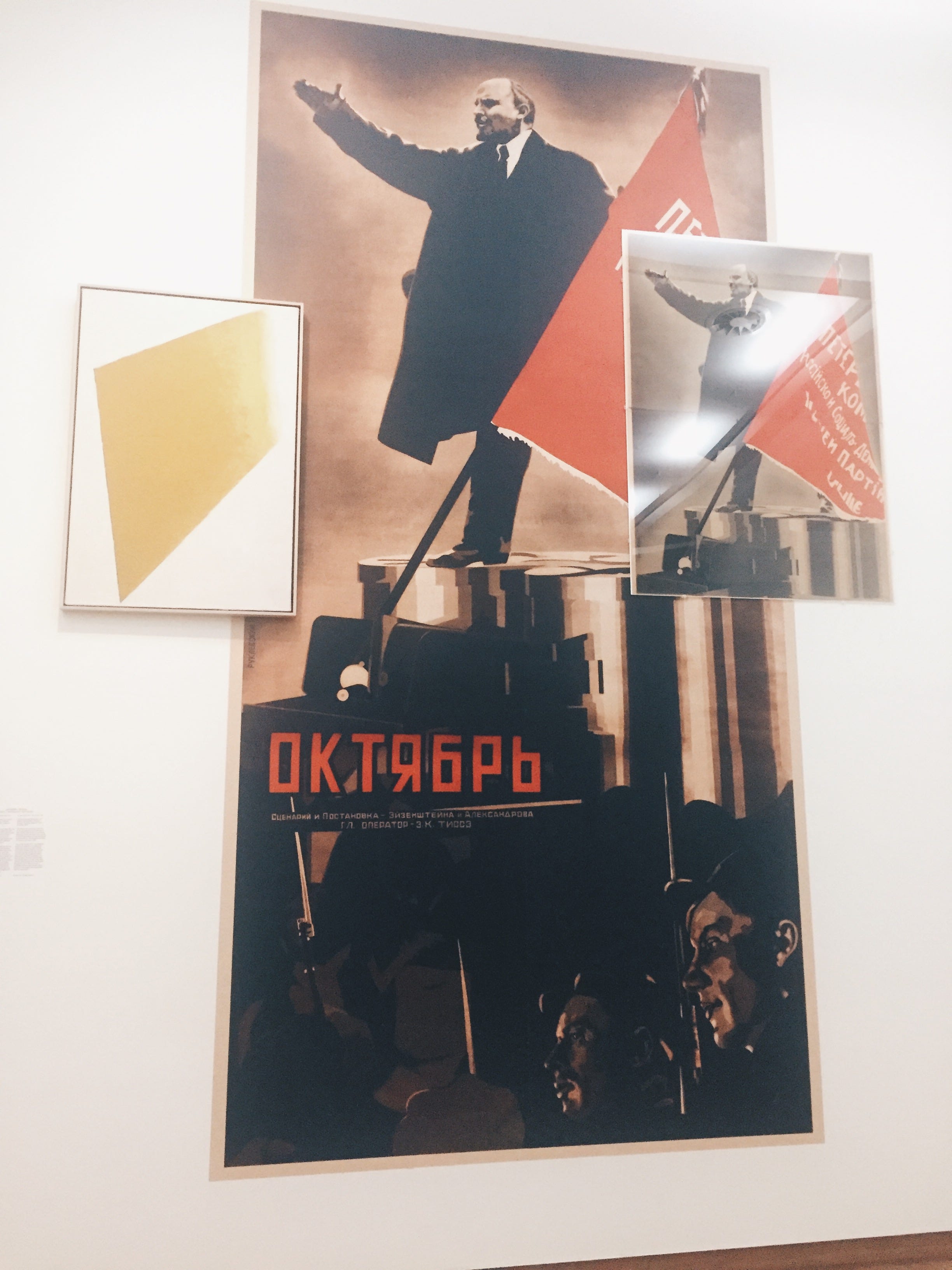

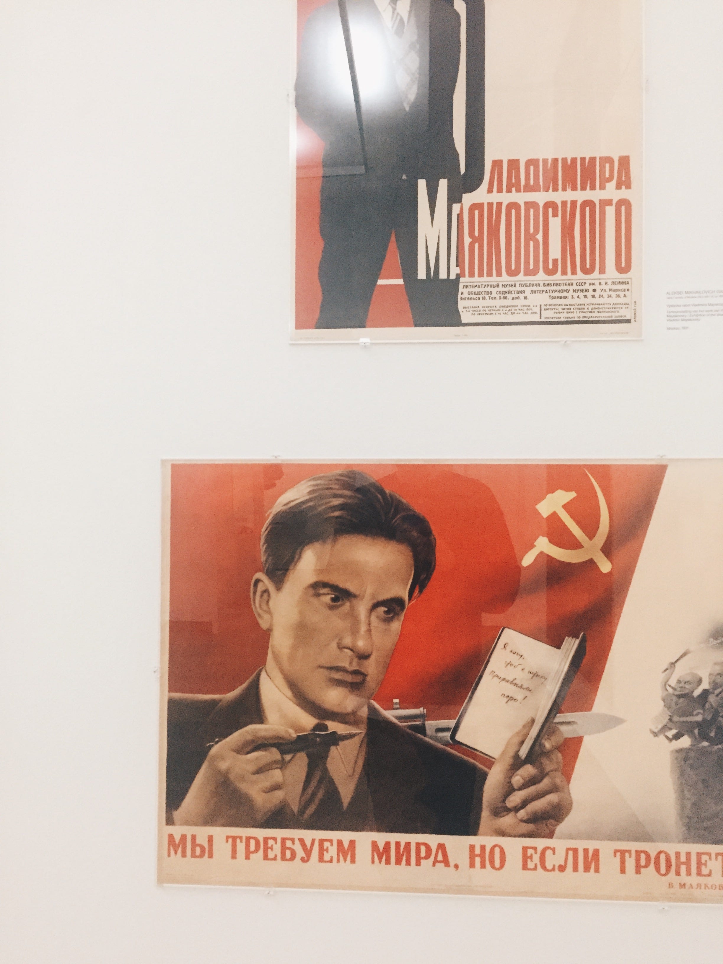
As well as these bigger posters there were a few tables showing smaller, flyer-sized prints using these collage and photo montage methods. Despite being all totally different in their method and made by different artists and designers almost all of them have a consistent style, that being, bold red and black colour, black and white photography/photo-montage and collages of photo on photo, photo on type and type on type. It all has an early modernist feel with its use of sans-serif (and Cyrillic) type, straight, vertical/horizontal lines and diagonal angles.
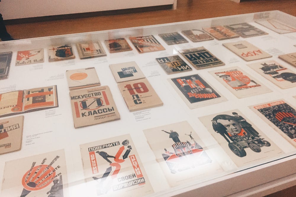
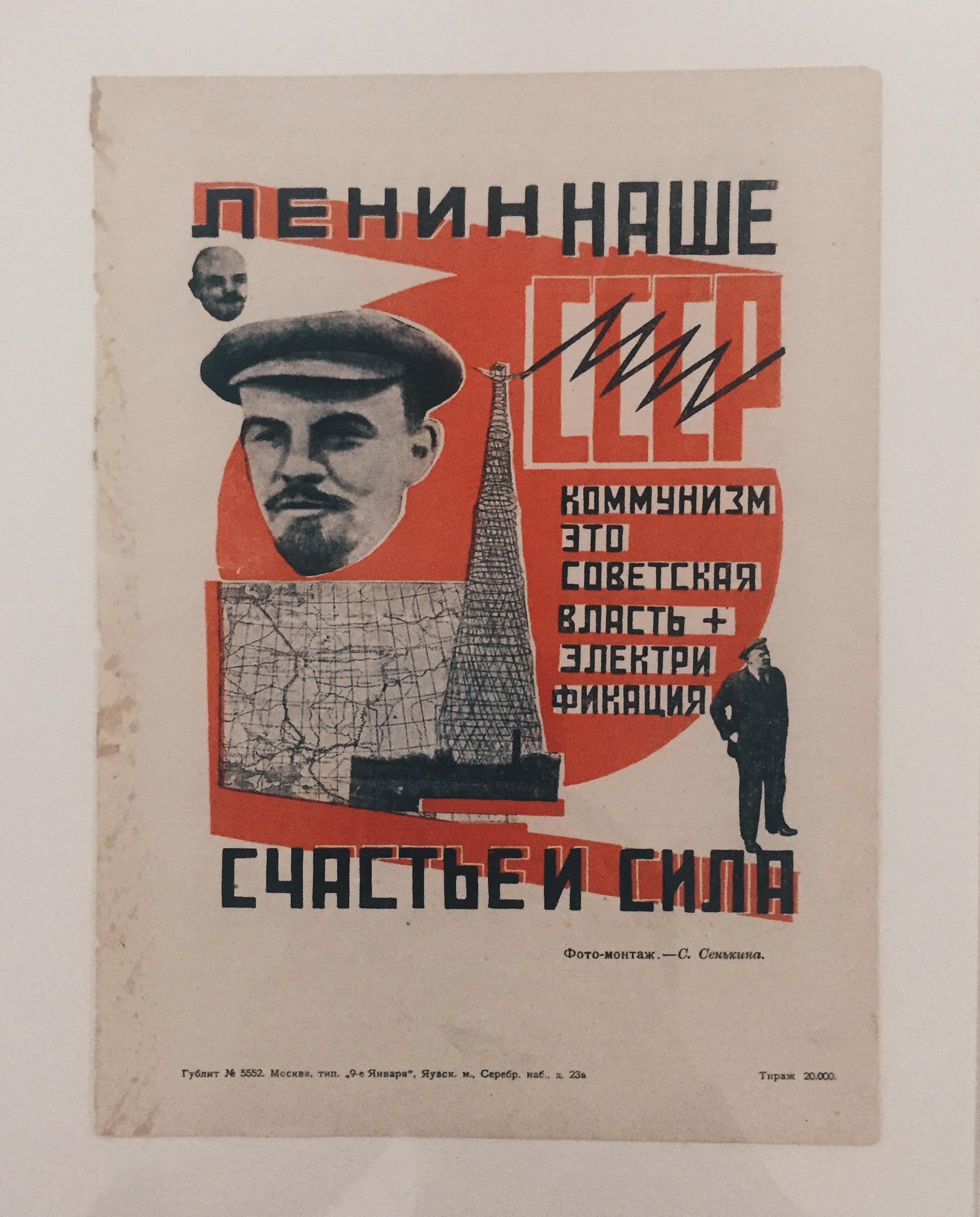
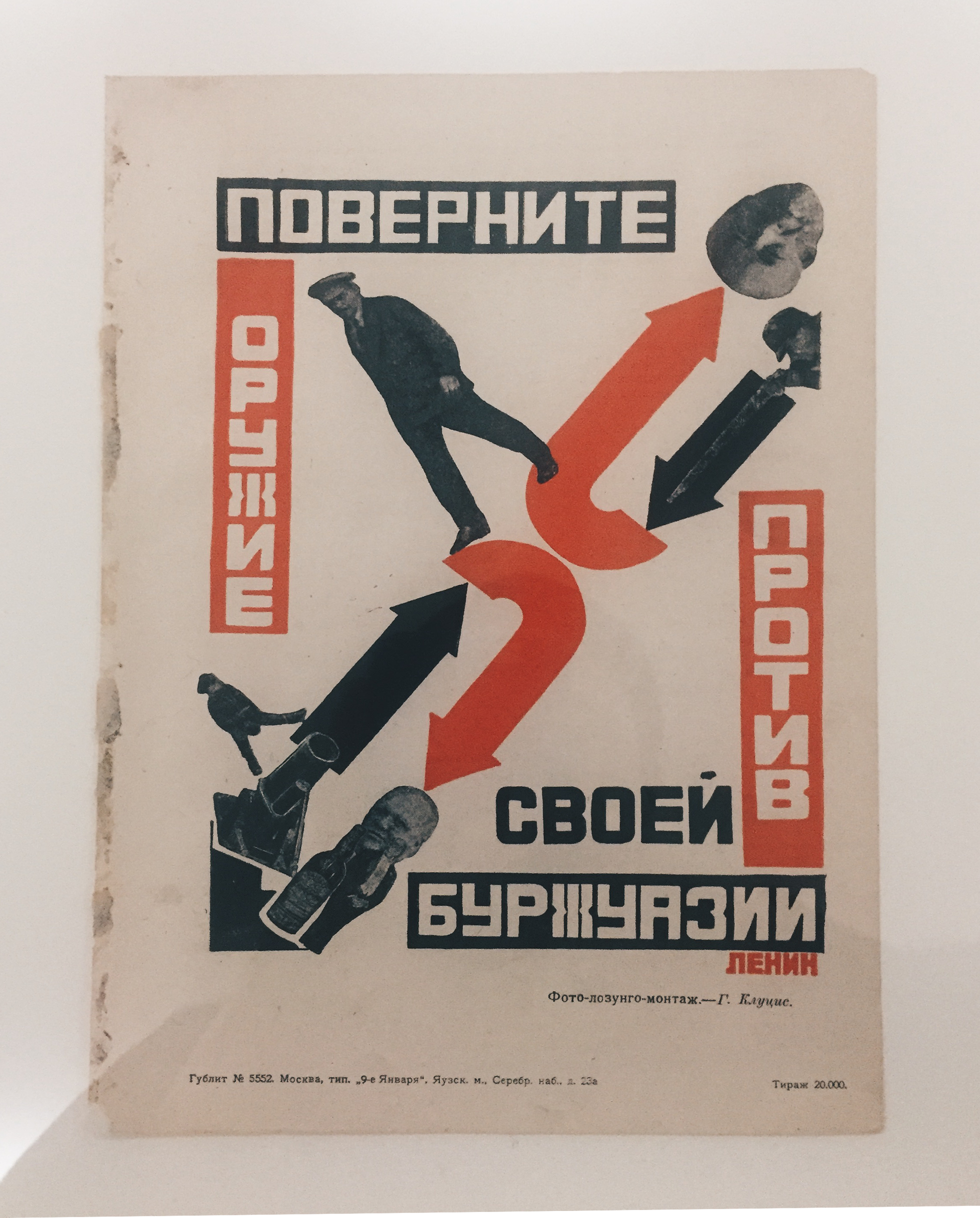
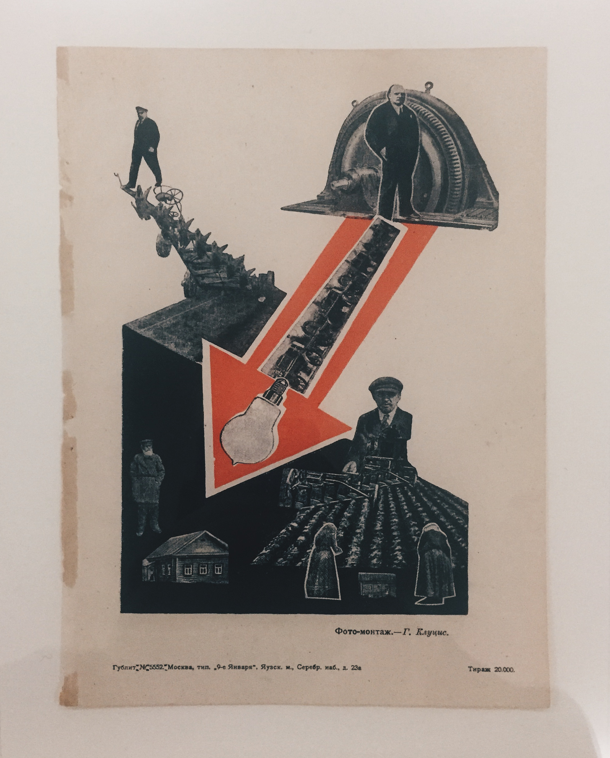
These are ones that stood out for me for their general composition and they felt the most ‘constructivist’, they feel inherently bold and its clear that they are conveying a strong message, obviously I can’t understand it but I don’t think you need to be able to read it to see that it is making a statement. The use of arrows here is a strong shape especially in this propaganda, it strengthens the idea of moving forward as a nation and/or a movement.
Some of the original posters had been especially enlarged for the exhibition allowing for maximum visual impact, I thought that enlarging this poster below was a great decision as it only emphasised the already loud and bold image. Repeating the same word in concentric circles increases the impact and also the use of colour here which is a lot more expressive than other prints and posters; it is titled ‘Enthusiasm: Symphony of the Donbas’, which combined with the vibrancy of the colours gives an overall positive and uplifting feeling.

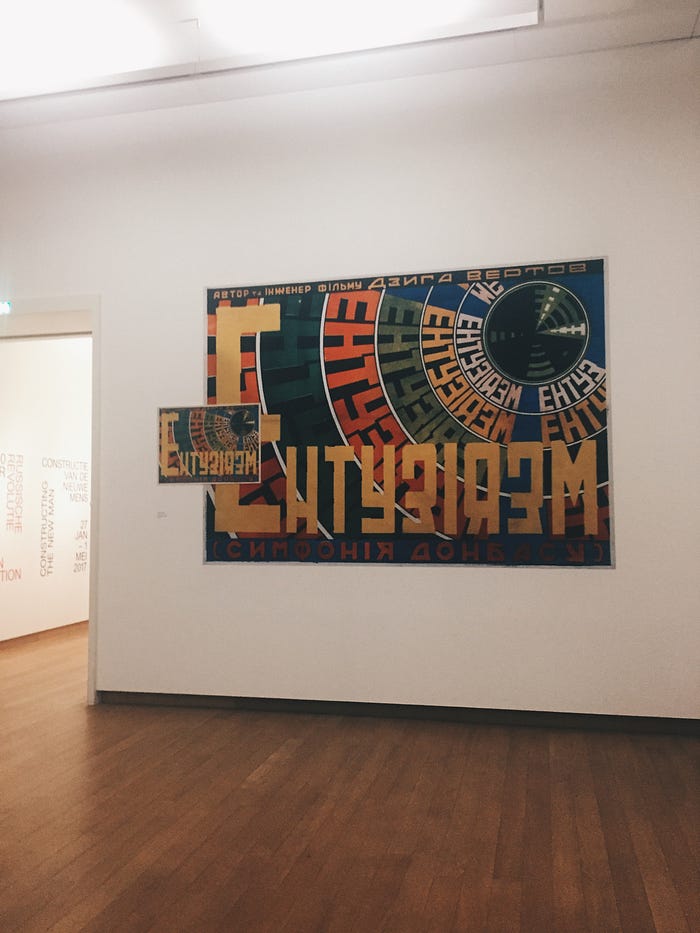
The use of blocky cyrillic letters reminds me a lot of one of the most well known Russian constructivist images by Aleksandr Rodchenko, this one of a woman yelling ‘КНИГИ/BOOKS’. They are both optimistic and have this idea of shouting a message to the audience, something that also appears in further constructivist imagery.

These kinds of constructivist posters have somewhat become the image or a stereotype of Russian art and design in general and have been pastiched multiple times for advertising as well as serving as visual references for other artists. The example below for Stolichnaya vodka uses the constructivist style to inform the viewer that the vodka is quintessentially Russian.
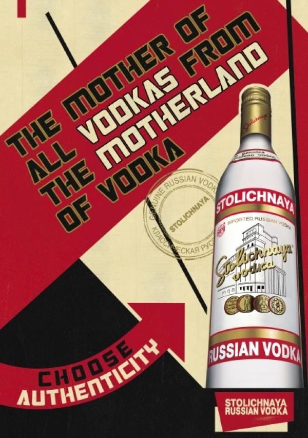

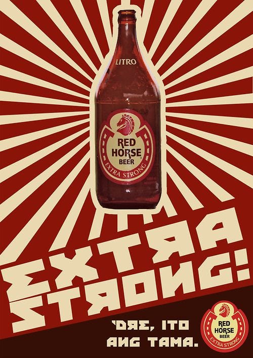
The style is also popular in design as a method to look bold and important, yelling the message to the viewer in a propaganda style but often it can look unnecessarily forced, especially when it is for something such as tea, beer or a classical music event.


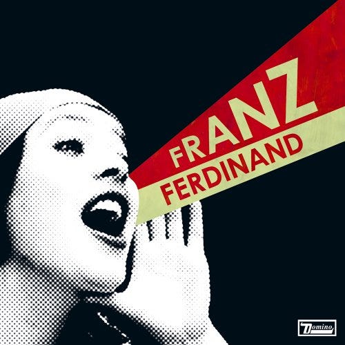
Another is this of the Franz Ferdinand album ‘You Can Have It So Much Better’ which is basically the same as the Rodchenko image above but replaces the word ‘BOOKS’ for the band name. Sure, it is referencing a great design movement but one that was of its time and for its reasons, here it is just so obviously a poor copy, I don’t think the music is inherently constructivist myself, but that’s up to you to decide.
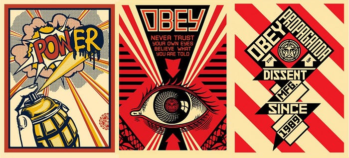
The street-artist Shepard Fairey also regularly uses a constructivist style to produce his artworks but instead of trying to look Russian or look like an original constructivist image he is using the form and treatment to create a propaganda feeling in his work, when using the statements he uses it seems to work and it feels cohesive. The use of red and black also creates an aggressive and powerful tone, again suiting the statements and messages inside.
Although, despite being somewhat more original in his work, this image below by Fairey was made around the time of the Obama election campaign and you can’t deny it looks incredibly similar to Rodchenko’s orginal work.


After the exhibition I was actively looking for similar things and when I went to London for a long weekend I saw that the Design Museum had an exhibition on Russian architecture, design and propaganda. It was also an excuse to visit the newly built Design Museum.
The exhibiti0n, ‘Imagine Moscow’, was in the basement of the museum which was a pretty awkward space and also it wasn’t allowed to take photographs so I have to try remember it as best as possible without images to help, although I did take notes and a few sneaky photographs as well as find a bunch online.

The space was divided into 7 different sections with 6 of these based on architecture designs and proposals which were never realised and the 7th based around Lenin’s Mausoleum which was realised, built at Moscow’s Red Square. The title of the exhibition is clever in that it alludes to what the content is going to be about, it allows you to imagine what Moscow could’ve been like with these immense buildings below.

The feeling of the exhibition was that of a somewhat dystopian place with these grand and adventurous architectural sketches, models and photographs of these unrealised buildings. Each of the proposed buildings was based around social purpose such as education, housing, health etc.

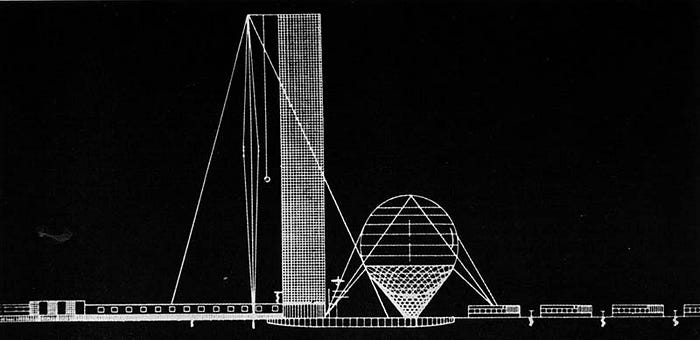
Ivan Leonidov’s Lenin Institute – an education space and library containing 15 million books which was to become the ‘collective knowledge centre of the USSR’. Lenin set out to fight illiteracy in the USSR by educating the new Soviet man and woman. The vast sphere in this sketch below would have been an auditorium for educational lectures with the tower being the library split over five reading rooms. As well as this, it was proposed that the building would also have contained science lecture theatres, a planetarium and a radio station to broadcast events to the world.
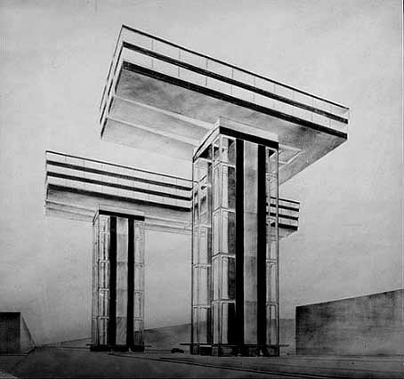
El Lissitzky’s Cloud Iron — a horizontal skyscraper to reduce overcrowding. His concept was a network of horizontal blocks in Moscow, placed on top of vertical columns. The horizontal sections would have been offices and apartments which would be connected to transport stations via the vertical upright columns. As well as a practical justification, Lissitzky wanted to give Moscow a new skyline to replace its old-fashioned past.
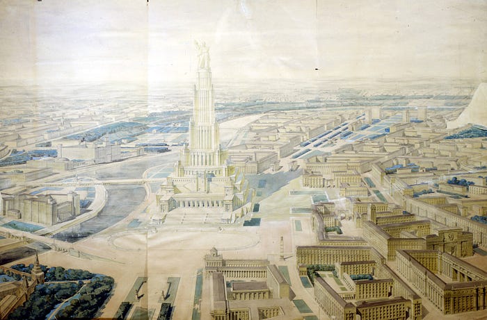
Boris Iofan’s Palace of the Soviets — a huge monument which would have been the tallest building in the world; here a proposed 100 metre statue of Lenin would have made the overall building around 516 metres. An incredible and dramatic expression of Soviet power. The building work was begun but stopped during WW2 despite already demolishing the city’s largest church already. Instead its foundations were converted into an open air pool. This would’ve been an incredible building and homage to Lenin and if it was realised, to give some scale, the Christ the Redeemer statue in Rio de Janeiro would be tiny in comparison at 38 metres tall compared to the 100 metres of Lenin.
The exhibition space, as I mentioned earlier, was awkwardly laid out and somewhat claustrophobic in the basement but upon reflecting on this, the layout was supposed to confuse and entrap you behind columns and walls, there is no clear route. The curator of the exhibition claims the layout aims to create a ‘surprising’ experience for the visitor that is not restricted to a historical timeline:
“The spiral shape requires active movement and generates surprising views between different exhibits. The exhibition’s curation revolves around the ‘phantoms’ without any hierarchy or chronology, which work both as a series and as autonomous parts.”

As well as the architectural sketches, photographs and models were quintessential constructivist artworks by El Lissitzky, he is almost seen as the constructivist artist with his unique style of simple geometric shapes and abstract forms with basic colour. He was able to challenge conventions within art – combining architecture and flat shapes. His work covered art, graphic design, typography, photography and architecture with the somewhat modernist ideals it deeply influenced later modern art such as early De Stijl artists and the Bauhaus.
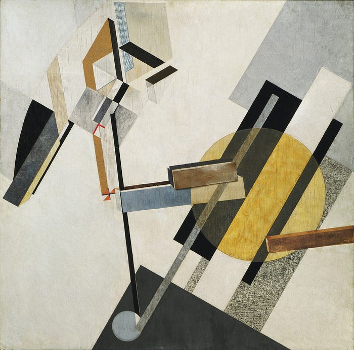
His ‘Proun’ series he said existed at “the station where one changes from painting to architecture.” These paintings combined basic forms and shifting axes–culminating in multiple perspectives and intriguing lines. These works may be considered fundamental to the development of modern abstract imagery, and a great influence on acutely industrial modern architecture.
Lissitzky’s influence in graphic design cannot be overstated. He was one of the first artists to use a restricted and pared-down palette of primary colors, black and white, text, and basic forms to tell stories and inform as well as to make very powerful political statements. Arguably his most famous piece, ‘Beat the Whites with the Red Wedge’ reguarly appears in graphic design history lectures. Here Lissitzky has used his somewhat signature and easily recognisable combination of red, white and black, which reinforces the message indicated by the work’s title. Colours and shapes take on directly symbolic significance and semiotics. The sharp red wedge clearly symbolises the Red Army revolutionaries that were penetrating the cicular defences of the anti-communist White Army.

I think that this image sums up the constructivist art and design movement whole-heartedly because it fits this definition:
“The seed of Constructivism was a desire to express the experience of modern life — its dynamism, its new and disorientating qualities of space and time. But also crucial was the desire to develop a new form of art more appropriate to the democratic and modernizing goals of the Russian Revolution. Constructivists were to be constructors of a new society — cultural workers on par with scientists in their search for solutions to modern problems.”
From seeing these kinds of exhibitions Constructivism is now definitely on my list of ‘ism’s’ and movements of which I am interested in – the old stuff that is, not the pastiched new stuff. It sits nicely alongside the likes of Brutalism, Modernism, Suprematism, Bauhaus, De Stijl, Dada, Pop Art, Op Art, Modern Art, Comtemporary Art and a handful of others in terms of art, design, architecture, fashion and film.
Read more blog posts on craig-berry.co.uk or my Medium page.


