Beazley Designs of the Year 2018
Showcasing the best in international design.
Written by Craig Berry
Designer & Writer

It is 11 years since the Design Museum began what is now known as the Beazley Designs of the Year Award, a project that sets out to show innovative new work from around the world. Whilst in London for the annual London Design Festival I managed to find time to check out the latest iteration of the Beazley Designs of the Year exhibition. I had previously witnessed the 2015 exhibition, somewhat by accident, so I had an idea of what to expect this year in terms of the variety of designs.
I’m still to be fully impressed by the new Design Museum, I very much preferred the old building, however, this exhibition was interesting in terms of curation and selection. A number of the pieces included in this exhibition have also been featured in our internal VBAT email, Innov8, where we document 8 innovative and new design projects each month.
Below are several pieces which I found most interesting; obviously as a graphic designer, there are a lot of graphic design projects here. However, there are projects in the exhibition also on the subjects of fashion, product design, transport and digital.
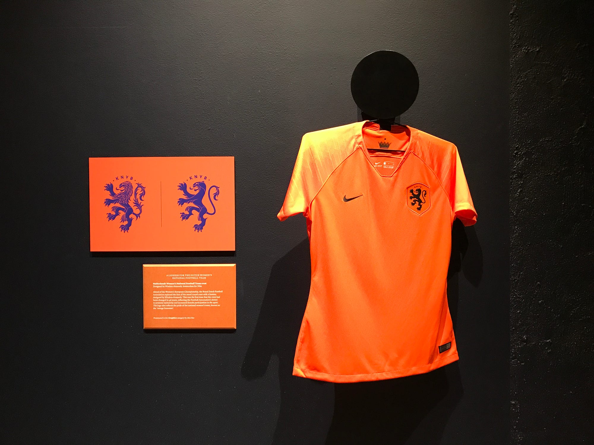
A Lioness for the Dutch women’s national football team
Wieden+Kennedy AMS – Netherlands Women’s Football Team Crest 🇳🇱
Graphic Design
Ahead of the Women’s European Championship, the Royal Dutch Football Association (KNVB) replaced the lion of the team’s royal crest with a lioness. The first time the crest had been changed in 46 years reflected the Football Association’s desire to promote inclusivity and increased female participation in the sport. The crest, or logo, also reflects the pride of the national women’s team who are known as the Oranje Leeuwinnen (orange lionesses).
“This is an idea that is so much bigger than just a campaign or logo update. It’s an idea that will endure and a strong statement that will help to continue to accelerate the growing momentum around women’s football. It’s a message that gives female players something of their own to rally behind.”
Hannah Smit, Art Director at W+K Amsterdam


A journal that unravels global migration
Offshore Studio – Migrant Journal 🇨🇭
Graphic Design
Migrant Journal is a print-only publication by Offshore Studio which investigates how people, goods, flora, fauna and information travel across the globe aka migration, hence the name. Launched in 2016, when the idea of migration (especially of people) was very prominent in current affairs, the content inside includes a variety of text, imagery, maps, infographics, data visualisation and photography, all compellingly presented to “explore critically the relationship between global systems of flow and notions of territory and space, crucial to understand today’s society”.
This is a publication which is exploring the well-trodden subject of migration but in a new and exciting way through great editorial design. The printed and physical format here is an important factor which makes this publication work so well; if it was an online blog or website it wouldn’t feel the same.


A coin designed to be counterfeit-proof
Royal Mint & David Pearce – New £1 Coin 🇬🇧
Product Design
The new British £1 coin designed and released last year by the UK Royal Mint has been designed to be much harder to counterfeit than its predecessor, a much more simple, circular coin which was becoming increasingly easier to forge. Now, a 12 sided, bi-coloured coin with multiple security features such as micro-lettering and an integrated hologram; one side displays the number 1 and the other, a £ sign the coin has been designed to be counterfeit-proof.
The ‘tails’ side of the coin was designed by David Pearce, a then 15-year-old student who beat 6000 other entrants, including adult professionals, in a national competition.
It is still to be discovered if this new design is ‘counterfeit-proof’, time will tell if it can be copied, it probably can but not on such an easy level as the old design was. Despite being the currency of my country of birth, I have been living in Amsterdam since this new coin came out so haven’t witnessed it that much for myself; also based on the fact that I rarely carry coins anywhere.


An interactive poster that lets you compose music
Studio Feixen – Oto Nové Swiss 🇨🇭
Graphic Design
In collaboration with the London performance venue Café Oto, Swiss graphic designers Studio Feixen created an interactive, typographic poster for the café’s three-day music festival, Oto Nové Swiss. Studio Feixen were asked to design whatever they thought suited the event and since it was organised by Swiss cultural institutes in London, they decided it wasn’t ideal to advertise with printed posters in the streets of London but instead, digitally and online. The viewer is invited to interact with the poster; cursor movements adjust typography and colour as well as sound.
This is a unique idea and exploration into poster design, it’s interesting to see that a Swiss graphic design studio would choose a digital-only poster considering the country has such a long affinity with printed posters. I think projects like this show the progressive nature of graphic design studios in 21st century Switzerland.


A tartan that celebrates diversity
Christopher Bailey/Burberry – Burberry Rainbow 🇬🇧
Fashion
To round off 10 years as Chief Creative Officer at Burberry, Christopher Bailey’s final collection was dedicated to an upgrade of the classic and iconic Burberry check pattern. The Burberry Rainbow check, now an official material, integrates the stripes of the rainbow flag into the beige, black, white and red pattern. The release of this Burberry Rainbow check coincided with Burberry making significant donations to support three LGBTQ+ youth charities.
This is a simple but powerful statement by Burberry as one of the biggest fashion houses. It’s great to see movements like LGBTQ+ becoming more present in the fashion industry.


A Lego project on an architectural scale
Bjarke Ingels Group – LEGO House 🇩🇰
Architecture
Bjarke Ingels Group (BIG) are known for their adventurous and un-conventional architecture and their design for LEGO House in Denmark is a perfect example of this. LEGO House is an activity centre for children to play and learn with LEGO, set in the Danish town where LEGO bricks were invented. The centre offers a variety of exhibition spaces and public squares, including a roof terrace and pixelated staircases which double as informal auditorium spaces. The colourful building has been designed with the idea in mind that it could be made from LEGO pieces, as the model below shows.


A railway network rebranded
Studio Marvil – Visual identity for the Czech Railway: SŽDC 🇨🇿
Graphic Design
Studio Marvil is a Czech design studio who create a new logo and visual identity for the Czech national railway, SŽDC (Správa Železniční Dopravní Cesty). Studio Marvil decided the name was impractically long and chose the letter Ž as a symbol for the whole network as ‘Železnice’ is the Czech word for ‘railway’. The Ž letter has been modified to resemble three parallel railway tracks and a railway switch and has been applied to everything from train carriages and containers to uniforms and stationery.
The whole identity feels so right for the railway industry; the symbol has all the right connotations and reminds me of the British Rail and Nederlandse Spoorwegen logos in terms of arrows and lines. The simple and modern application across various formats brings the identity to life.


A designer’s riposte to London landlords
Paul Cocksedge – Excavation: Evicted 🇬🇧
Product Design
Excavation: Evicted was Paul Cocksedge’s response to the threat of imminent eviction from his East London studio which was to make way for redevelopment. Unbeknownst to his landlord, Cocksedge drilled and excavated several tonnes of material from the floor and turned it into bespoke and beautiful furniture. Exposing layers of concrete, Victorian brick and other materials. The results revealed the site’s history while critiquing the state of the London property market.
I was amazed by this project, not so much the outcome but the bravery and audacity to drill so many holes from the floor of his studio; the outcomes though are incredibly beautiful and somewhat industrial, the message of the product adds the contextual element which ties it all together.


A plastic-free supermarket aisle
A Plastic Planet & Made Thought – Ekoplaza: Plastic-free aisle 🇬🇧
Graphic Design
Ekoplaza is a Dutch supermarket and opened the world’s first ‘plastic-free shopping aisle’ with a plan to expand the programme to all of its 74 stores by the end of the year. The plastic-free aisle features more than 700 products packaged in recyclable glass, metal, cardboard and biodegradable containers; all clearly signposted by the ‘plastic-free’ logo designed by Made Thought. This logo is clear, simple and instantly recognisable as to what it is for, providing a cue for shoppers to buy responsibly.


An archipelago for aquatic leisure
Marshall Blecher & Magnus Maarbjerg – Copenhagen Islands 🇩🇰
Architecture
Copenhagen Islands is a series of floating platforms that encourage public recreation in the Copenhagen Harbour. This project aims to bring life and activity to the city’s waterways in response to rapid urban development whilst also anticipating rising sea levels. These platforms each offer different amenities and features such as a sauna or diving board. They can also be brought together as a cluster for special and communal events.
This is a nice idea and, perhaps from the use of wood, feels very Scandinavian. I imagine in summer these would be very popular as they look like a great place to relax.


A football kit for a ‘New Nigeria’
Nike – Nigeria National Football Team collection 🇳🇬
Fashion
For the 2018 World Cup in Russia, Nike set out to design a football kit that would reflect the youth and dynamism of modern Nigeria. The design of the kit and collection is based around the concept of ‘Naija’ or ‘New Nigeria’, reinterpreting contemporary street style through the vibrant green and white of Nigeria’s national colours and abstracted feather patterns that pay homage to its ‘Super Eagles’ team kit of the 1994 World Cup.
The 2018 Nigeria kit went somewhat viral upon its release, it was easily the most popular kit of all those released for the 2018 World Cup with fans queuing up for hours and shirts re-selling online for huge mark-ups.


An iconic logo morphed into endangered species
Lacoste & IUCN – Save Our Species 🇫🇷
Graphic Design
To raise awareness of critically endangered animals, Lacoste, in collaboration with the IUCN (International Union for Conservation of Nature), replaced their iconic crocodile logo with 10 endangered animals; all close to extinction. A limited number of white polo shirts were made with the number of pieces available correlating with the number of each animal remaining in the wild. Proceeds from the sales were donated to each species’ conservation.
Much like the Burberry piece, this shows the power of fashion labels when attached to a charity; the outcome being a potentially iconic item and providing funds.


A dance of swarming drones
Studio Drift – Franchise Freedom 🇳🇱
Digital
Dutch duo, Studio Drift’s latest installation is a choreographed dance of 300 swarming, illuminating drones. Taking place over several cities and most recently above Amsterdam. The 300 drones were programmed to replicate the movements of swarms found in nature, reflecting on the tension between individual freedom and safety in numbers. The choreography was set to an original score by Dutch composer, Joep Beving.
This is one of the entries which I physically experienced myself in Amsterdam. Taking place on a Sunday evening it was a special thing to witness both visually and audibly.


Part of the exhibition was being asked to fill out a form giving your opinion on which design you felt was ‘the best design’ project. I chose to nominate the SŽDC identity by Studio Marvil; I think it is one of the best identity projects of recent times and also for the scale of the project. The exhibition at the Design Museum is on until 6 January 2019 and more on the nominees can be found here.
Read more blog posts on craig-berry.co.uk or my Medium page.