100 Years of the Bauhaus 1919–2019
Recent projects and exhibitions celebrating the iconic art school.
Written by Craig Berry
Designer & Writer
The Staatliches Bauhaus, or simply just, the Bauhaus, is one of, if not the most iconic art school of the 20th century. Operational from 1919 to 1933 across three locations in Germany, it combined crafts and the fine arts; gaining attention and fame for its approach which it taught its students and publicised to the world.
Throughout my studies I have always taken an interest and often applied a Modernist-inspired approach to my own academic, professional and personal design projects as well as having a general interest in the movement’s history across art, graphic design, product & industrial design and architecture. In 2019 the Bauhaus celebrates 100 years since its conception in 1919 in Weimar, Germany. Founded by the architect Walter Gropius as a merger of two schools; his goal – “to create a new guild of craftsmen (and women)*, without the class distinctions which raise an arrogant barrier between craftsman and artist.”
Around the same time in the early 20th century, other influential art schools and movements were also beginning and gaining attention such as De Stijl in the Netherlands (1917), Constructivism and Suprematism in Russia (1913) as well as Vkhutemas school in Russia (1920) which was compared to the Bauhaus for a similar approach.
Towards the end of 2018 and, in 2019 there are many articles on design blogs and some exhibitions across Europe covering the school’s history and legacy as well as contemporary takes on Bauhaus for exciting new projects; either directly using its general aesthetic (minimalist use of colour and form) or its approach and principles (form follows function). Here I wanted to share some recent, interesting and generally nice looking Bauhaus themed projects and their creators.
- Despite the Bauhaus’ progressive approach to gender equality, it has been criticised as many female members went unnoticed both during and after the school’s short existence and that, during times, its administration was rooted in ideals of the past and misogyny.
It’s Nice That/Sascha Lobe – Printed Pages AW18 cover
December 2018

Every six months, the design blog, It’s Nice That, puts out their Printed Pages magazine; a collection of select articles from their website as well as additional, exclusive, magazine only content. They are not themed as such but more the cover reflects a common—sometimes loose—thread throughout the issue.
For their AW18 issue, Sascha Lobe—recently appointed partner at Pentagram—created a series of covers using a typeface he and his team at L2M3 created for the Bauhaus-Archiv / Museum für Gestaltung. The characters are only a handful of the 600± made for the identity; nicely applied onto red, yellow and blue covers indicative of the Bauhaus aesthetic: “We took heritage and adapted it to today without losing the history”.
The polymorphic typeface, named Bayer Next, takes obvious cues from the experimental 1925 Universal typeface—a geometrical, sans serif design by the former student and later Bauhaus director of printing and graphic design/advertising, Herbert Bayer—whilst giving the graphic forms of the Bauhaus a contemporary feel.


Gmund x Bauhaus Dessau Foundation Paper Collection
November 2018

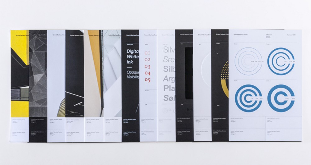
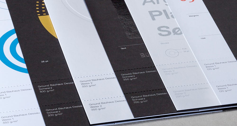
Gmund (Büttenpapierfabrik Gmund) is a German-based paper company known for their innovation and creativity in the paper industry, appreciated by creative minds and leading designers. Together with the Bauhaus Dessau Foundation—an artistic, academic and scientific foundation who aim to preserve and convey the Bauhaus, its ideas and its themes—they have created a new paper collection: Gmund Bauhaus Dessau.
The collection is both Gmund’s and the Foundation’s shared fundamental philosophy of material appropriateness and material research of immensely high quality. The dialogue between material and design had a specific significance at the Bauhaus, where paper also played a central role. Retrospectively describing his pedagogy, the Bauhaus master Josef Albers declared, “First we seek contact with material.”
The collection is available in two clear white tones and deep black with no texture, no effects, a smooth surface, available in a magnitude of weights 120–350) and specially conceived for large print-runs.
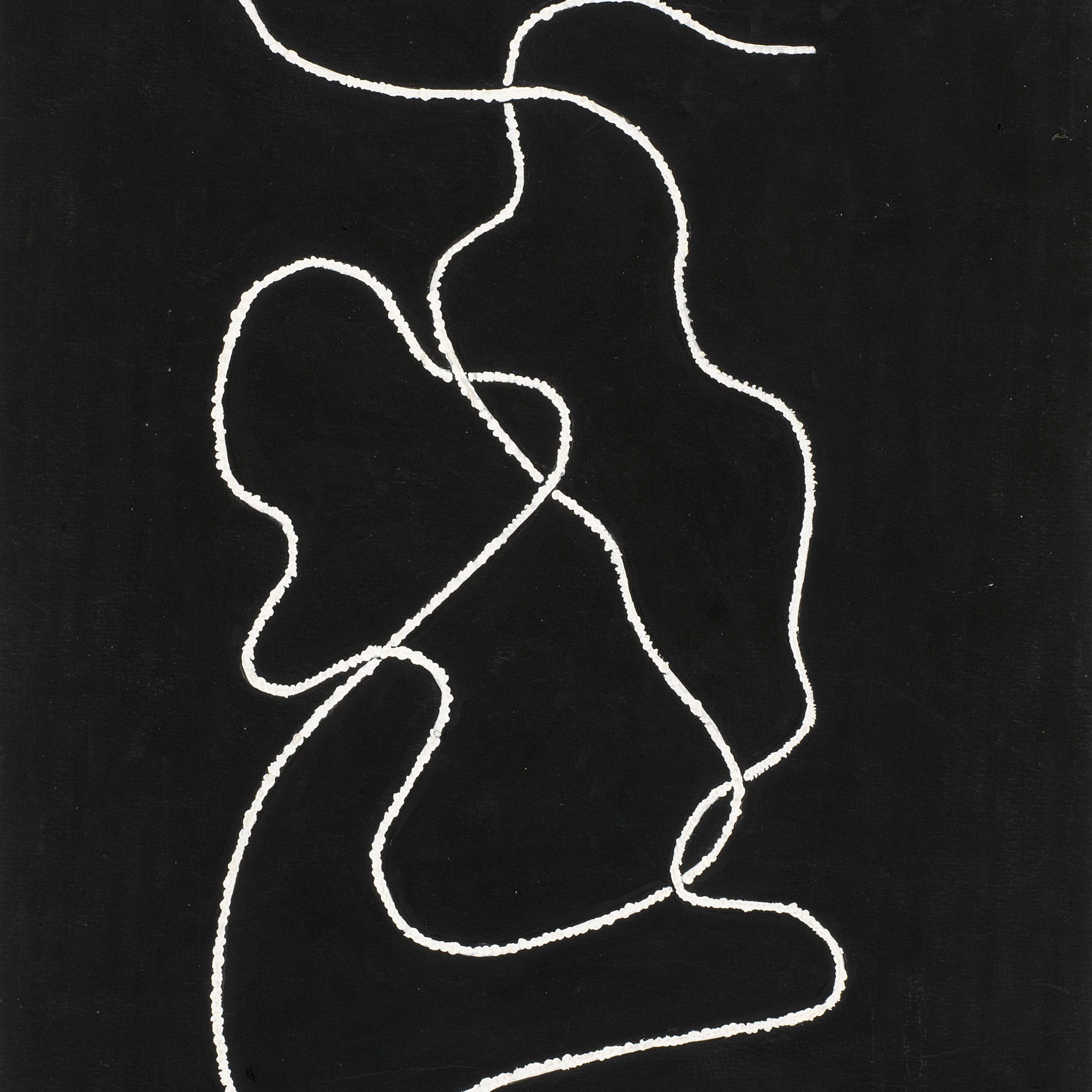
Tate Modern – Anni Albers exhibition
October 2018 – January 2019

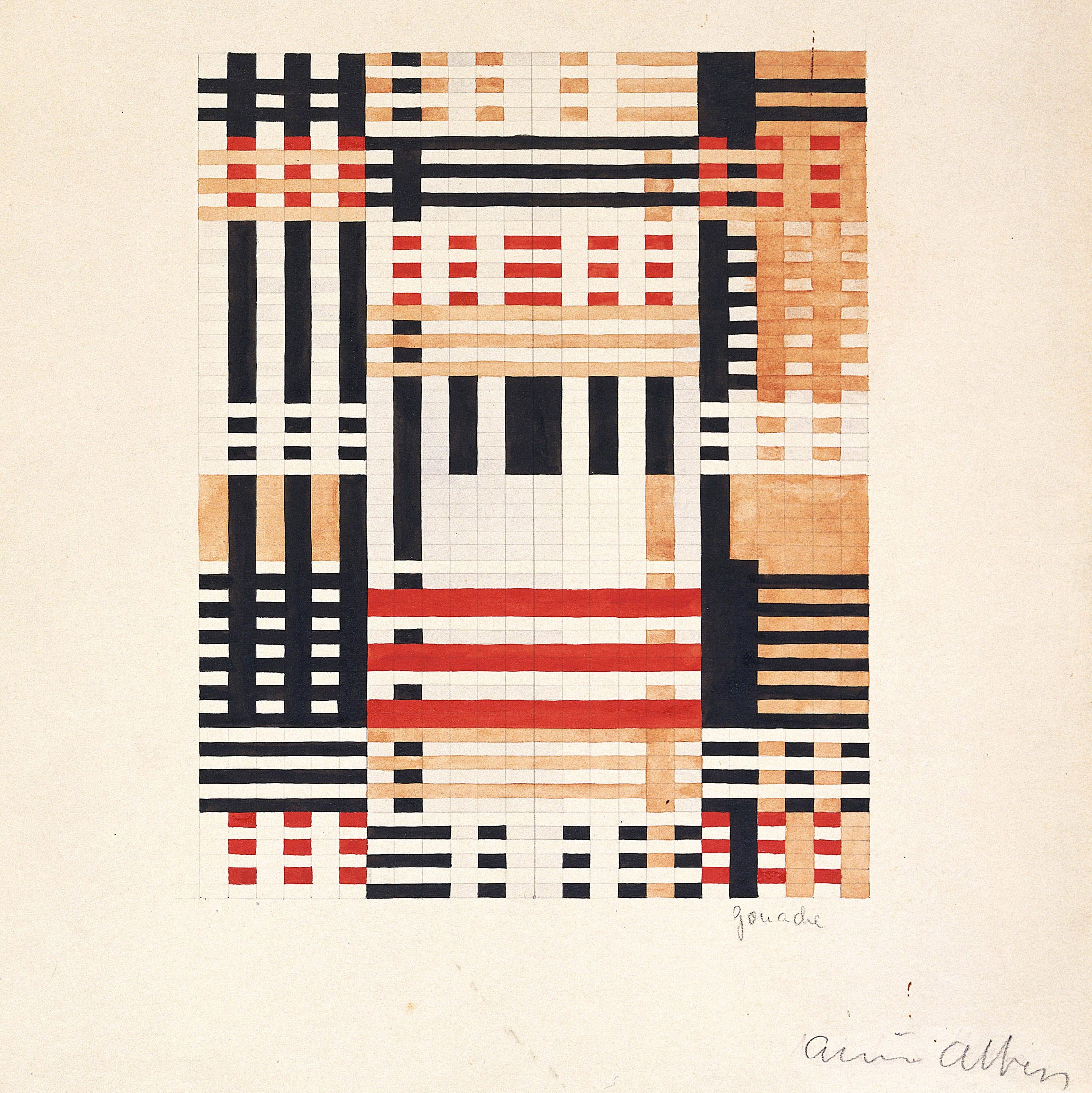
From 11 October 2018 to 27 January 2019, Tate Modern in London held an exhibition of Anni Albers’ work; specifically her textile pieces, exploring how she combined the ancient craft of hand-weaving with the language of modern art. As one of the key female protagonists of the Bauhaus along with the likes of Gunta Stölzl, Lucia Moholy and Marianne Brandt the work shows that the Bauhaus was not and should not be known solely for the work of its male students, professors and masters.
This large and impressive exhibition highlighted the artist’s creative process and her engagement with art, architecture and design with more than 350 objects on display including small and detailed ‘pictorial weavings’ to large wall-hangings and the textiles she designed for mass production, as well as her later prints and drawings.
The core of the exhibition was an exploration of her seminal publication—published in 1965—On Weaving and the wide source material she gathered together to create the book.

Adobe – Hidden Treasures of the Bauhaus Dessau
June 2018

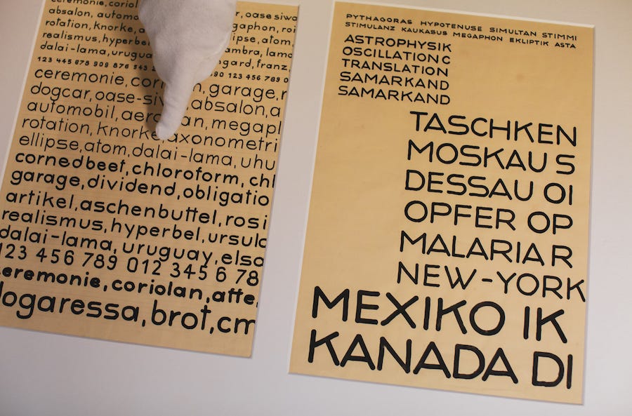
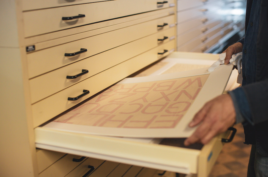
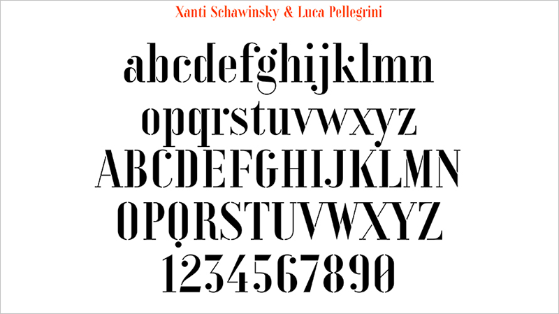
Typography and the study of type design played an important role at the Bauhaus and in June 2018, many original sketches of un-finished typefaces and un-published letterforms were re-discovered at the Dessau building. Adobe, working together with students guided by the renowned German type designer, Erik Spiekermann meticulously completed and digitised sketches to create and publish five new typefaces.
Each of the five typefaces is named after students and teachers at the school and they each characterise the Bauhaus typographic image, a marriage of form and function using clean lines and geometric shapes.
Joschmi (named after Joost Schmidt) by Flavia Zimbardi.
Xants (named after Xanti Schawinsky) by Luca Pellegrini.
CarlMarx (named after Carl Marx) by Hidetaka Yamasaki.
Alfarn (named after Alfred Arndt) by Celine Hurka.
Reross (named after Reinhold Rossig) by Elia Preuss.



Boijmans van Beuningen – Netherlands ⇄ Bauhaus exhibition
February 2019 – May 2019
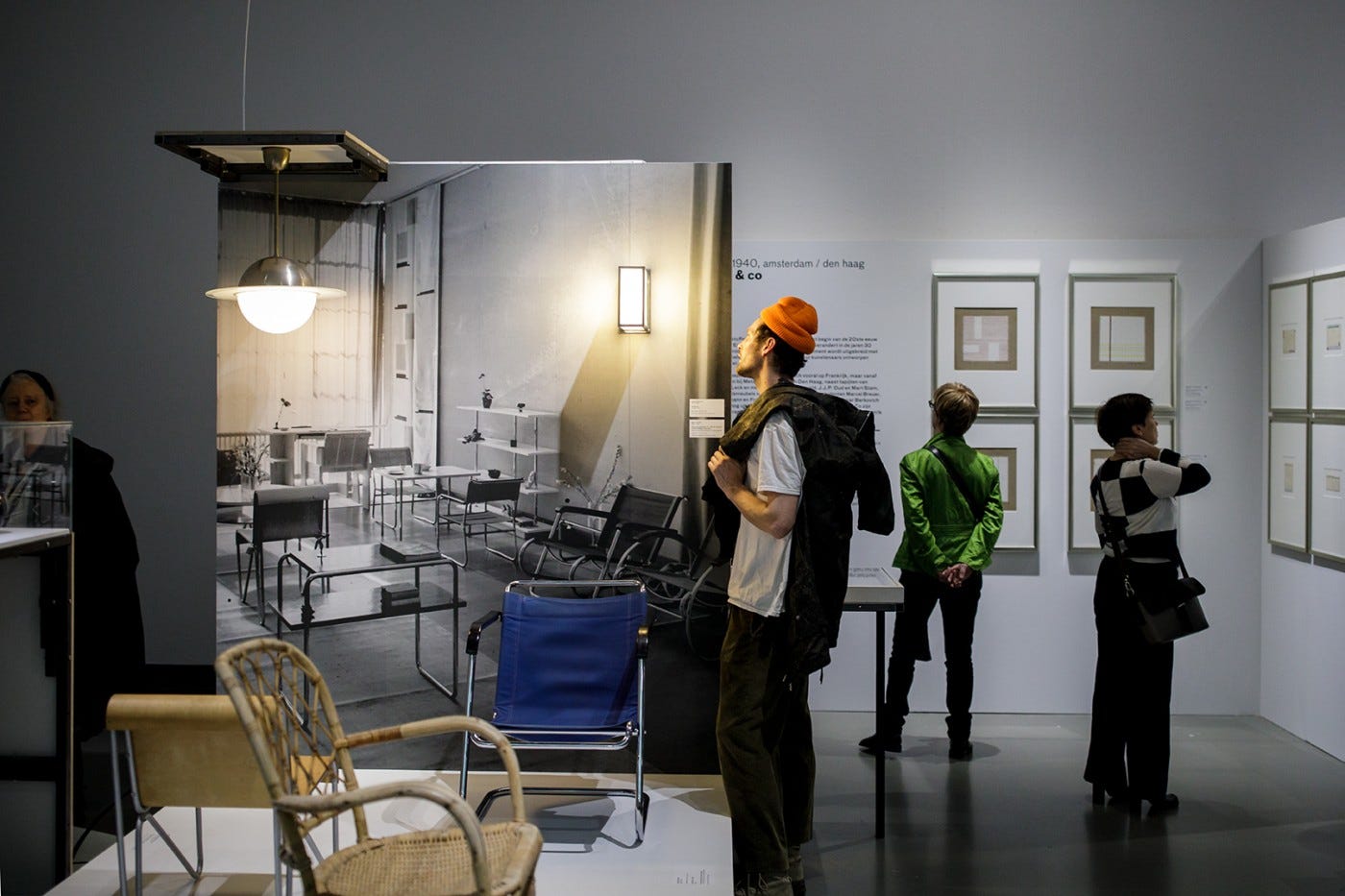
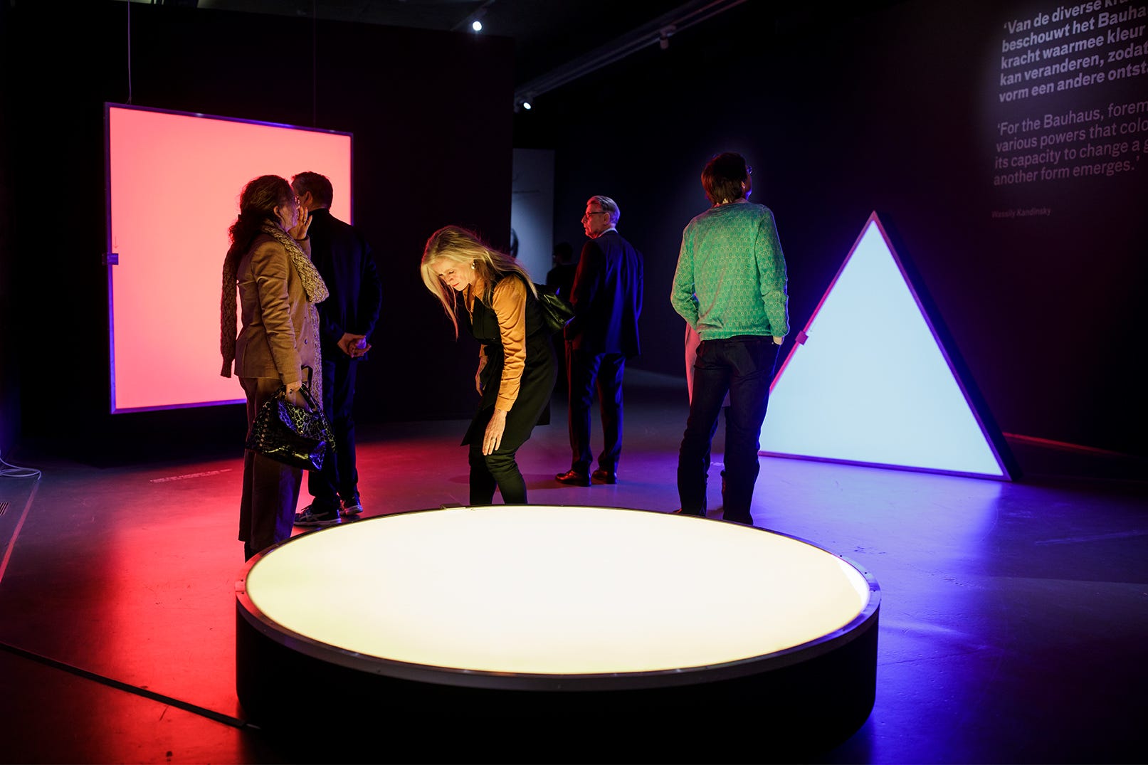
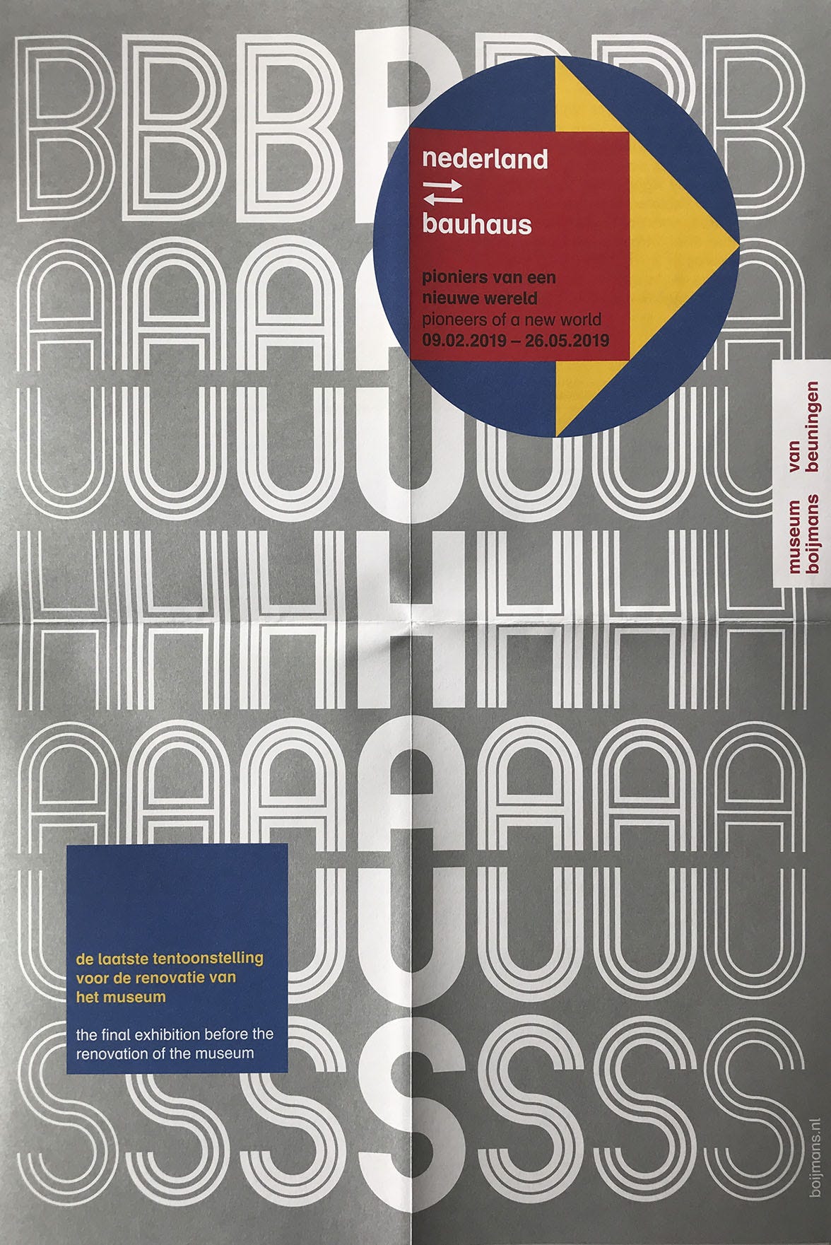
Despite being German the Bauhaus school was inherently European with students and teachers coming from countries all across the continent. The latest, and final (for several years) exhibition at the Museum Boijmans van Beuningen in Rotterdam showcases the Dutch aspect of the Bauhaus and explores the idea of “pioneers of a new world” on from 9 February to 26 May 2019.
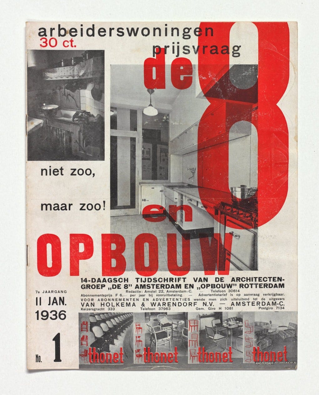
Throughout its time, various Dutch artists and designers contributed to the school’s character. Before the Bauhaus existed people like H.P. Berlage and Mathieu Lauweriks were members of the Deutsche Werkbund (1907), an important predecessor and inspiration for the Bauhaus and also artists of De Stijl (1917) were an important inspiration and reference point for teachers and students whose ethos was spread through their magazine.
This massive (1500m²) exhibition explores the Netherlands’ contribution to the Bauhaus through around 800 (200 from the Boijmans collection and 600 on special loan) various products and designs as well as post-Bauhaus contributions as around 30 teachers and students fled to the Netherlands where they later established businesses, designed for Dutch industry and were active in art and design education. The exhibition also showcases the impact of the Bauhaus in the later 20th century in the Netherlands through the likes of exhibitions at the Stedelijk Museum.
There is also a Bauhaus party–Bauhausfest—on the 25th May, celebrating the exhibition and school through music and Bauhaus performance.



Google – Bauhaus Doodle
April 2019
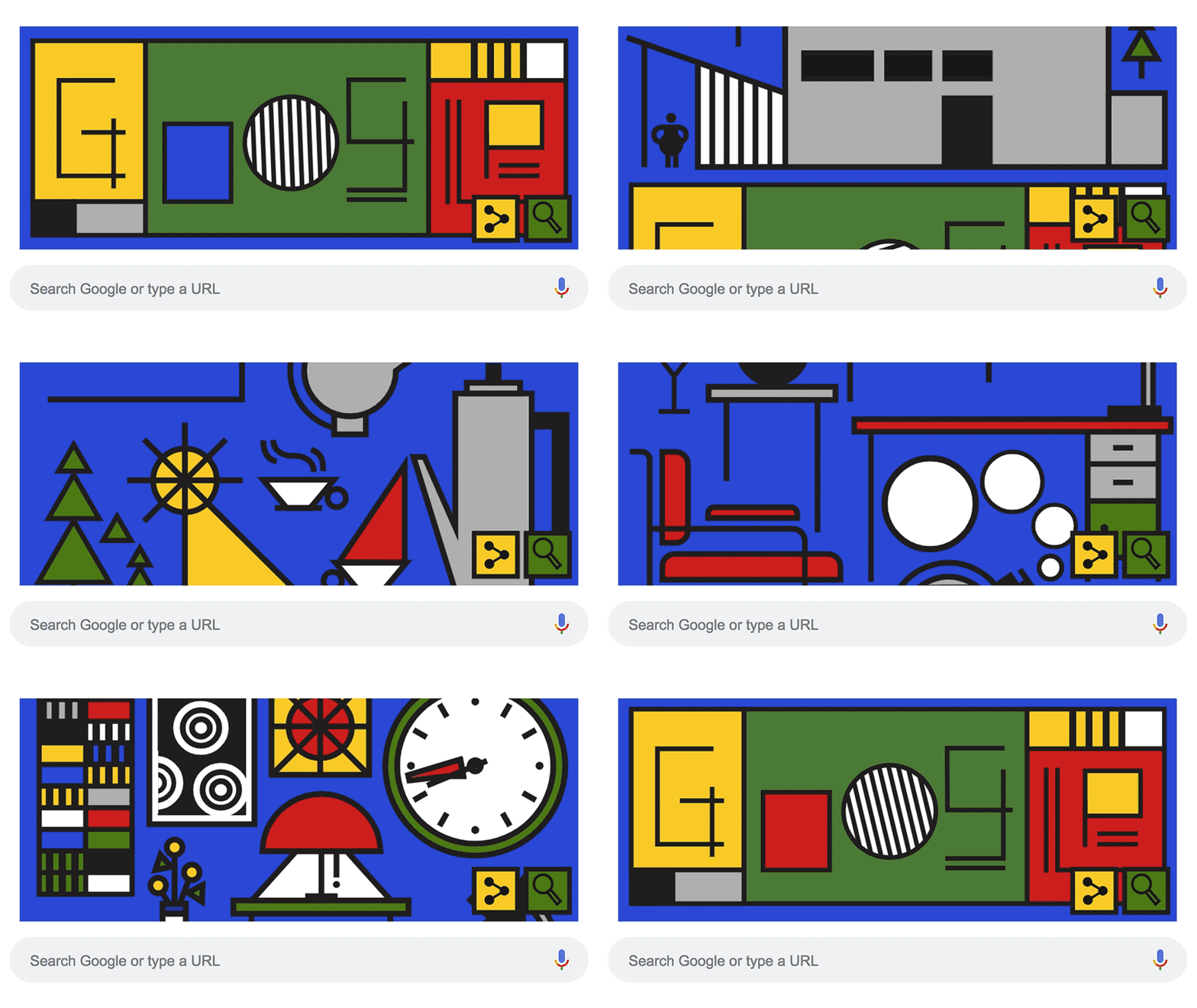
On April 12th— the supposed day the Bauhaus opened in 1919—Google celebrated the 100th anniversary through its Google Doodle.
The scrolling animation shows several Bauhaus designed objects such as a chair, a lamp, a clock, a tea-pot and several other products as well as a building resembling the Dessau building. Some of the objects in the animation may be referring to these specific products by Bauhaus students and teachers.

This isn’t the first time Google has created a Doodle based on the Bauhaus as they created a version in March 2012 honouring the architect Ludwig Mies van der Rohe, the Doodle was inspired by the Crown Hall building at the Illinois Institute of Technology, designed by Mies van der Rohe in 1956.

@iampommes – 36 Days of Type, Bauhaus Style
May 2019

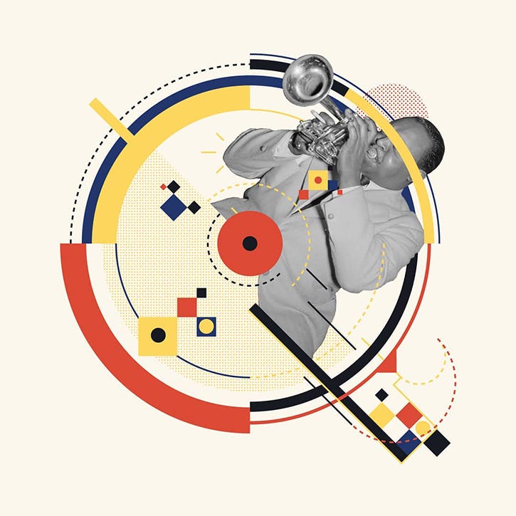

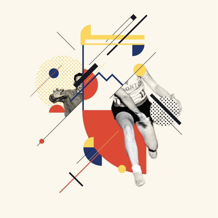
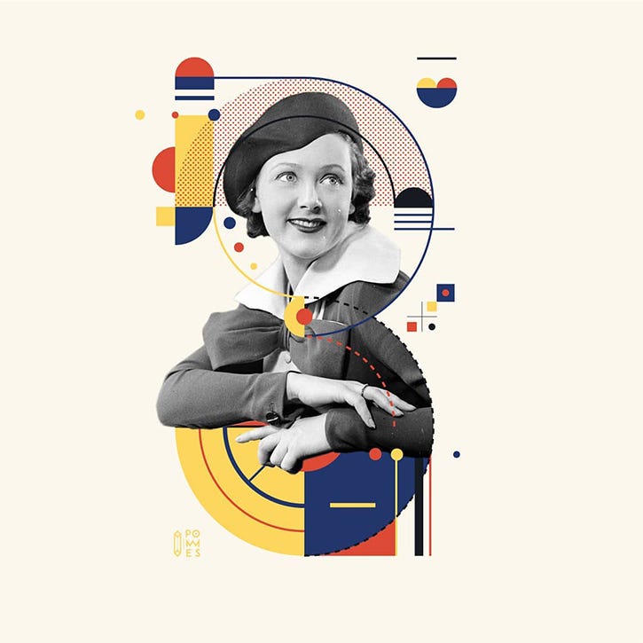
Each year in April and May, designers on Instagram commit themselves to the 36 Days of Type initiative where as the title would suggest, they create a piece of type every day, for 36 days; starting with A–Z and then 0–9. This usually wields the same kind of result each year with designers choosing to focus on a set style for all 36 days or to switch it up daily, creating unique designs.
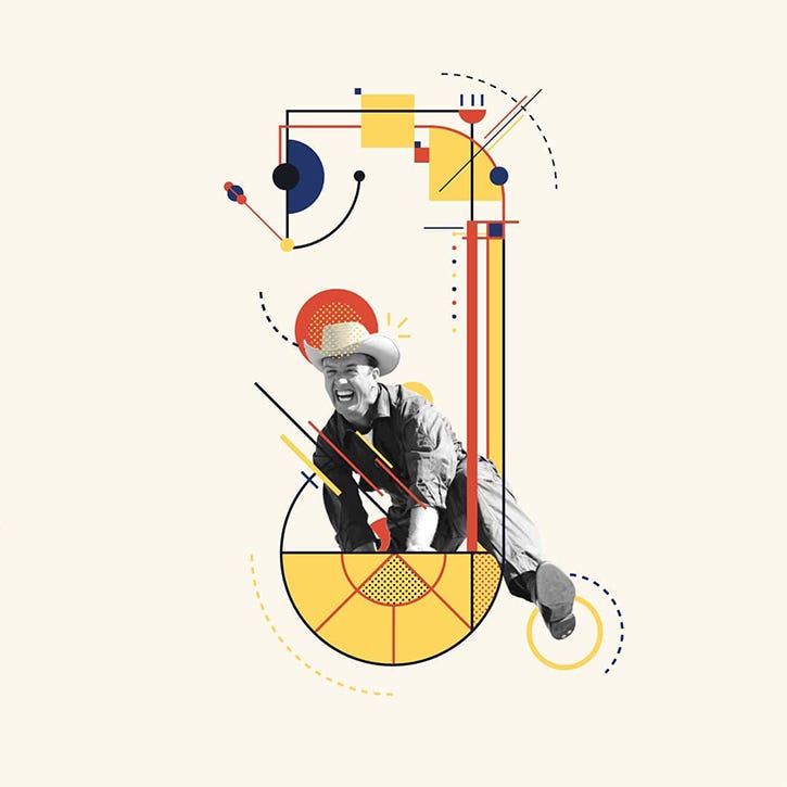
@iampommes on Instagram decided to dedicate his 36 days to 36 Bauhaus inspired letters, taking geometric shapes and forms, combined with black and white photography to create an interesting and unique concept for type design.



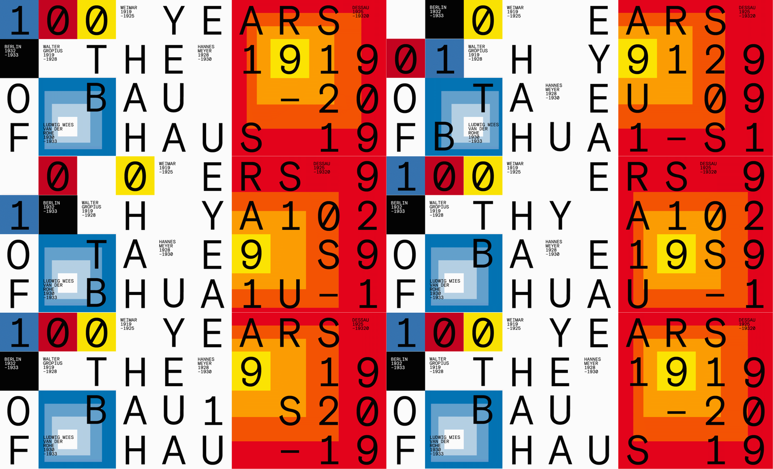
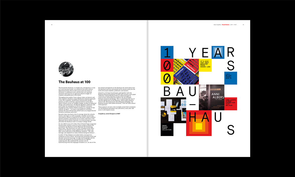
This medium article is based on a column written for Fonk Magazine #257, April 2019. I also developed a modular and adaptable graphic system for this article and column using a mono-spaced font, geometric shapes, a minimal colour palette and graphic shapes similar to Josef Albers’ colour studies.

Read more blog posts on craig-berry.co.uk or my Medium page.
